‘Transformation’ – Evaluation of Submission

At the start of the project, I spent a significant amount of time looking at various ideas which could come together and exploring areas which could work, but many were rejected.  Generation Loss as a project has taken much more effort than the other projects on the course, as it is has been technically demanding pushing me in all aspects of photography but time consuming to prepare the submission.  In the last 9 months I have valued the learning experiences from the course, which have had a dramatic impact on my outputs in the medium:

  • Plan shots and ideas well before I go near the camera
  • Shots need to be cohesive when presented together
  • My images need to say something to the viewer
  • Careful use, or removal of, the colour palette can have a dramatic impact on final results

In my research for this project, one of the outcomes was a desire to conveying beyond my own views visually, per-se, but prompting the viewer to question intentions and meaning of what I present.  This concept I started becoming aware of during the second term, but has really only become solidified recently, through the final project.  In addition to building on my learning experiences, the project I hoped would:

  • Prompt the viewer of my images to question intentions and concepts behind whats being presented
  • Images would retain an aesthetic cohesion despite degeneration

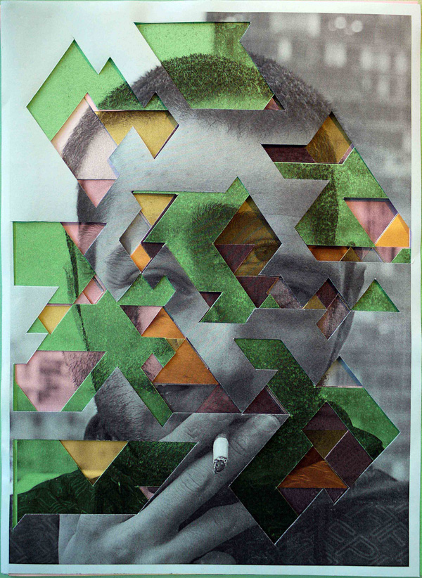
Pritts demonstrates very clearly that partial degeneration of images can have dramatic impact.  I felt her images did suffer to some degree, as while I think in areas beautiful, I don’t think they communicated much beyond partial degeneration or offered the viewer areas to ponder.  Dina Goebel really influenced me here, as did the works of Lorna Mills to question and think deeper about what I wanted my work to evoke for the audience.

Technical Evaluation
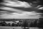
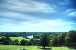
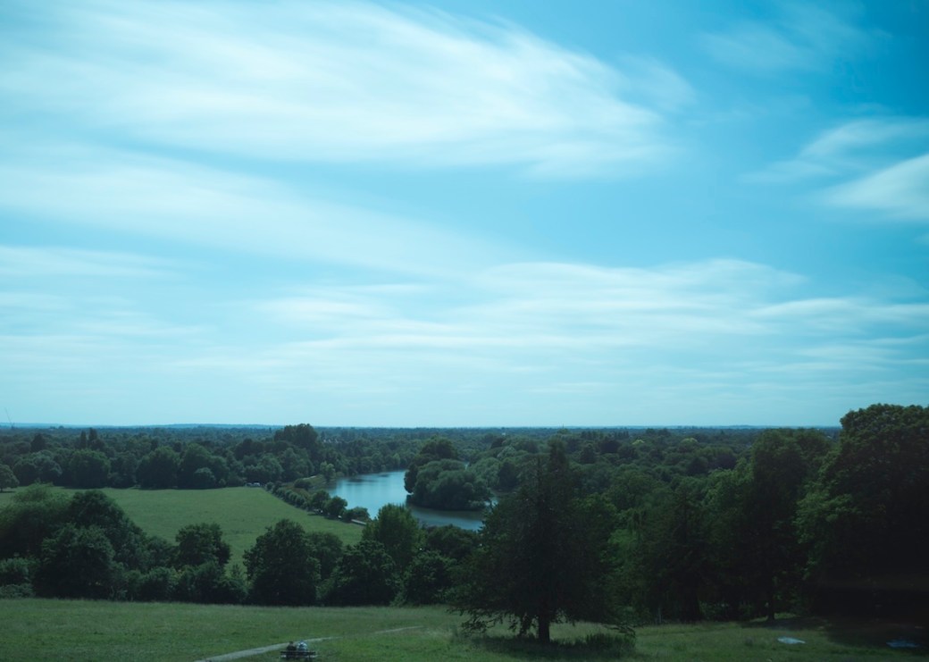
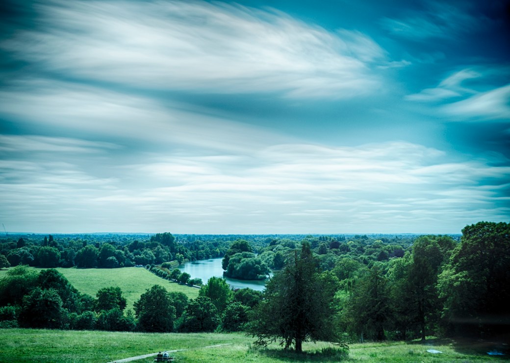
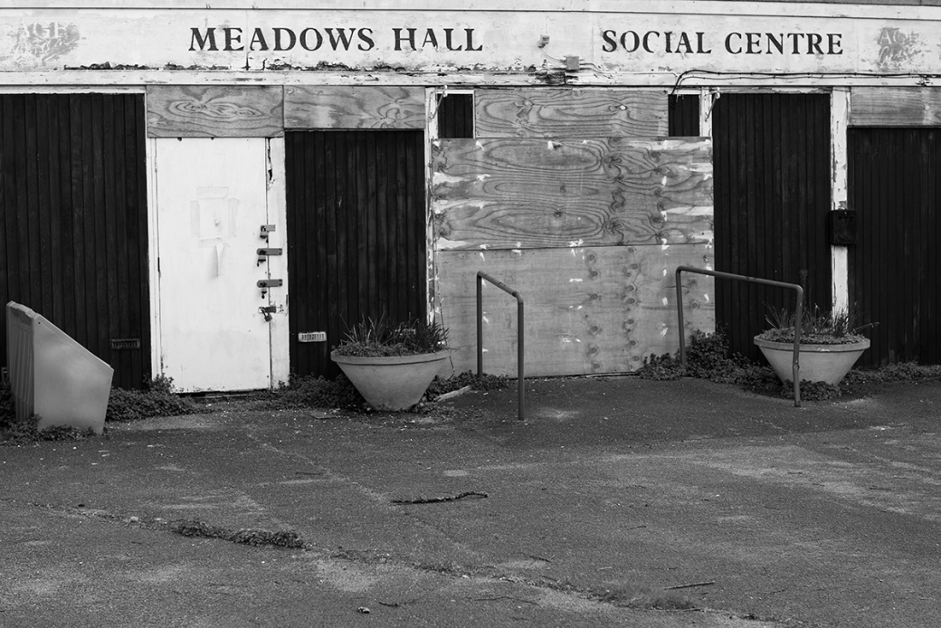
The first base image (Richmond Hill) involved long exposure photography, three different filters in operation simultaneously and tone blending of three exposures.  In the last project, for the studio submission, the use of 7 lights and taking a group portrait challenged my technical abilities significantly.  In this project, however, the technical demands have been right behind the camera and in post production (of sorts).  These shots alone took me three days to get right, while tone blending needed experimentation during the project.  This is an area I need to follow up on, as I am not fully comfortable with the colour outputs from the tonal blending process.  The second base image (Wheat in the Wind), also a natural organic image, took a couple of days to get right also.  In sum, I am pleased with the base images used for the Generation Loss project, they took time to formulate and get right.

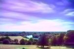
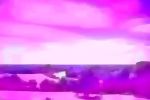
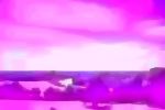
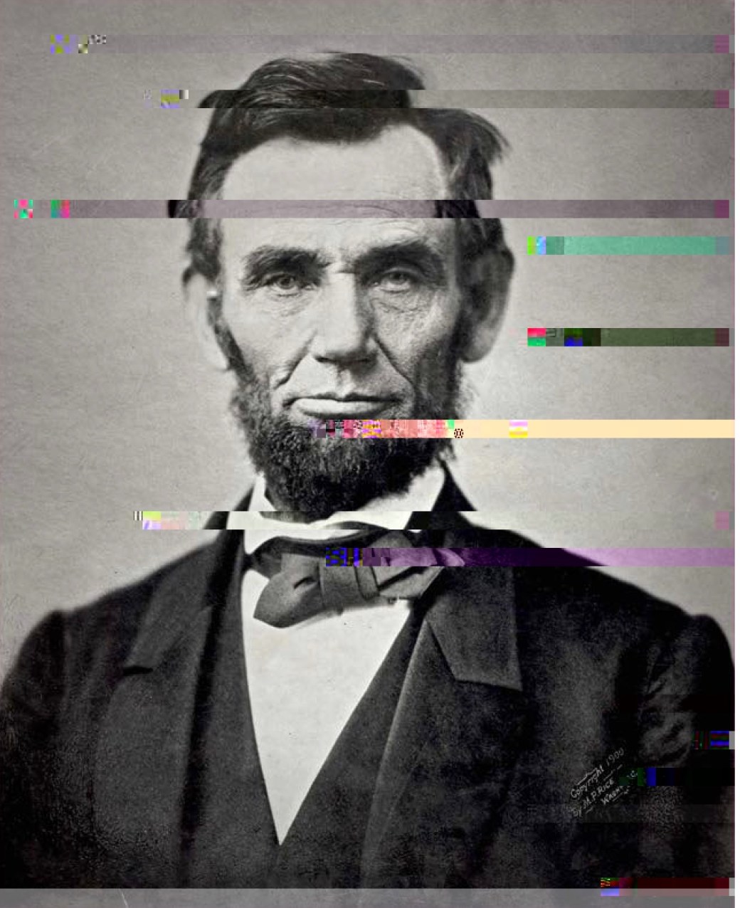
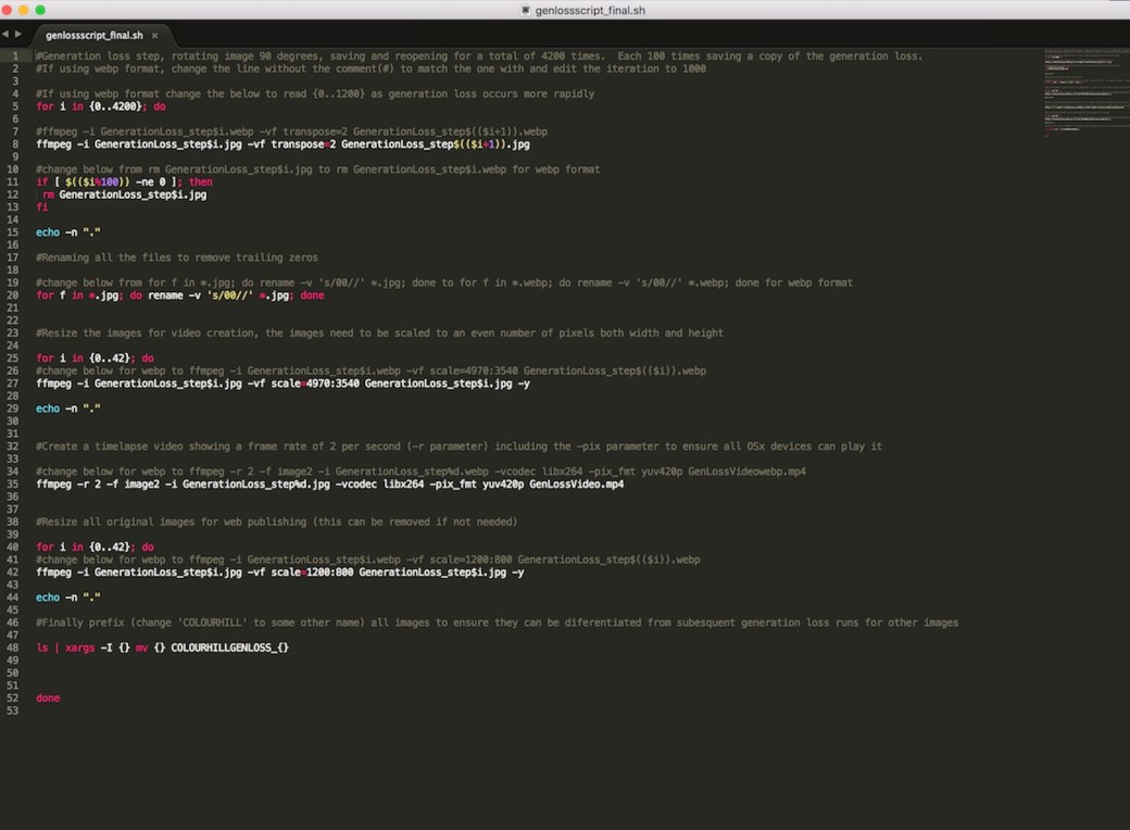
The process of writing a batch shell script and creating Generation Loss iteratively has, by in large, been successful, creating both still images and time-lapse videos.  In testing I was pleased with the outcomes following this process in a variety of formats.  While webp format is not a file type I am likely to use, the degeneration process created some nice abstract images and colours.

Aesthetic Evaluation
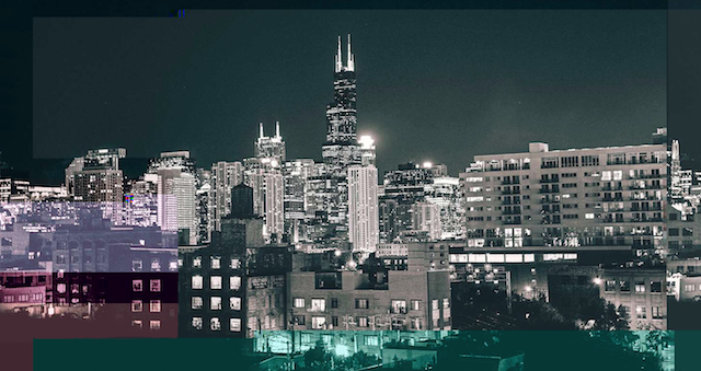
The decision to ensure all Generation Loss images are visually cohesive has been important to the final submission.  Presenting jpg Generation Loss in B&W worked so much better than in colour, however, the webp degeneration in colour was a really nice surprise in testing.  The second key outcome for me has been the communication of ideas and particularly looking to prompt questions in the minds of the viewer about underlying concepts associated with Generation Loss.  The semiotic elements of what digital degeneration means, digital durability, current sociopolitical issues surround the digital era are complex subjects, which society has yet to answer.  While I have opinions on these topics and ideas, it is more important for me to stimulate the independent unique views of each viewer rather than communicate my own, instead communicate the concept and the viewer to question that concept.  I hope viewers are stimulated by the images and videos from the project, but something which is impossible for me to evaluate.  I am delighted however, that I have reached this realisation about my own photographic work and something I am likely to always carry with me.

Evaluation of Mediums – Time-lapse and Print 
To me, the submission is both still images and video presentation.  I received a positive appraisal from class, following matt printed images, which together comprise the rotation and degeneration of images of 100 times in each print.  Colour jpg total degeneration took 4200 iterations, while B&W took 3100 iterations.  The jpg Generation Loss in B&W totals 32 images in print (1 original and 31 prints of each 100 iterations), while both colour webp total 13 prints each (1 original and 12 prints of each 100 iterations). My printed submission and presentation will therefore feature 58 still images. I wanted to keep the video and prints at increments of 100, to demonstrate the rate at which different file formats change.  Matt finish really worked so much better than gloss printing when I investigated both.

We looked briefly at time-lapse video techniques during the term, but generated the videos in a completely different way.  The time-lapse videos communicate in a more visceral way, but with less permanence.   I believe the project has been successful and glad I took Generation Loss that but further than Pritts to follow my own interpretation of what these images may look like and where they could go in the project.  My major concern has been over cohesion of the Generation Loss artistically, but pleased with the final results.  Hopefully these images do prompt other questions and ideas in the minds of the viewer, beyond what I am communicating on the surface.


Criteria 2, 3, 4, & 5

‘Transformation’ – Final image selection for submission

After testing Generation Loss for a few weeks and creating lots of files I am not likely to store for any period of time, I took the matt printed images to be evaluated by the class.  I was really surprised that my approach had met with broader approval, as it concerned me that the aesthetic cohesion of the images would be lost.  The submission is based on the three images, but on the written submission have included time-lapse videos with the still images for the project.

Submission 1: B&W Richmond Hill, jpg Generation Loss


Submission 2: Colour Richmond Hill, webp Generation Loss


Submission 3: Wheat in the Wind, webp Generation Loss


Criteria 2, 3, 4 & 5


‘Transformation’ – First Generation Loss Test

Having taken the base images and then prepared the batch process for Generation Loss, the results were very interesting.  I started with jpg losses on the colour image from Richmond Hill (Base Image 1).  Below I have shown both the Generation Loss in time-lapse and in a slide show of the individual images:


This slideshow requires JavaScript.

Evaluation – Generation Loss Test
I am pleased with the incremental degeneration from the batch script and can see these images moving well over time.  Time lapse works much better to present these ideas, however, my tests have shown that jpg file format degenerates into grey, while webp moves into pink and blue colours.  To keep these time-lapse and images coherent, the jpg Generation Loss will be conducted on the B&W image (from the first base image), while webp Generation loss will be conducted on the colour images of Wheat in the Wind and Richmond Hill.  Aesthetically, the selection of the image and the impact of degeneration needs to be considered.

‘Transformation’ – Technical Planning/Coding

Generation Loss – The Process
Before I could look at Generation Loss, I had to decide how to achieve this practically.  In the case of of the Instagram reposting, this was one file type (jpg), how would other file types respond to Generation Loss and would this have an aesthetic bearing on the images.  Each step in the Generation Loss project would need to cover, at least initially:

  1. Rotate the image 90 degrees save the image
  2. Repeat step 1, thousands of times
  3. Every 100 times, save a copy of the image
  4. Conduct the same Generation Loss process for differing file types

As I examined how this task was going to play out practically, it dawned on me I would not be able to complete this manually.  My research had thrown up some interesting automated image manipulation ideas (http://snorpey.github.io/experiments/).  Georg Fischer creates his own degeneration and prompts viewers to manipulate images directly.  His ‘Glitch Experiments’ were really interesting, as he is to some degree looking for an aesthetic quality from degeneration and deconstruction and providing the viewer with the ability to control the effects of glitches upon the image of Lincoln (https://fishnation.de/):

Screen Shot 2017-07-16 at 08.52.17

So I set to work creating my own batch script (most of the batch scripts for Generation Loss I found which were publicly available, failed to work when I looked at them):

Screen Shot 2

The code I have listed out below (Generation Loss Coding – Batch Script), for others to reuse as a shell script.  It can be copied pasted into notepad directly and saved with an ‘.sh’ extension.  It is written for Linux and would recommend anyone interested in repeating the Generation Loss process, installing the user friendly linux operating system ‘Linux Mint’ (https://www.linuxmint.com) and downloading and installing the free software programmes ‘ffmpeg’ and ‘Handbrake’ to batch process Generation Loss.

Generation Timing and File Formats
In testing, the jpg format degrades to a complete grey in around 4200 iterations, however, other formats which degrade much more quickly provided more interesting results with blues and pinks stylising the images.  Webp format in particular provided lovely degradation images in 1000 iterations and fully degrading at 1200 iterations.  In looking at the results of the scripts, I then amended it to create a time-lapse showing degradation over time (included in the coding below).  I followed this by compressing the video sizes using ‘Handbrake’, as the 20 second videos were initially >380MB.  I found a frame rate of 2 (2 frames per second), yielded best results, as this visualises the degradation rates of different formats well (much longer for colour jpg at 4200 iterations, B&W jpg at 3100 iterations and shorter for webp, 1200 iterations).

Generation Loss – Test conclusions
The iterative process of running code to generate >4200 iterations and create time-lapse video took 40 minutes on a modern i7 laptop per base test image.  The generation loss in jpg formats move to a complete grey mass over time, while other formats have more interesting colour shift and patterning such as webp.  I wanted a strong aesthetic quality to the images and decided my Generation Loss project would therefore focus on only two file formats jpg (4200 iterations) and webp (1200 iterations).

Generation Loss Coding – Batch Script – Copy below and save with ‘.sh’ extension via notepad
#Generation loss step, rotating image 90 degrees, saving and reopening for a total of 4200 times. Each 100 times saving a copy of the generation loss.
#If using webp format, change the line without the comment(#) to match the one with and edit the iteration to 1000

#If using webp format change the below to read {0..1200} as generation loss occurs more rapidly
for i in {0..4200}; do

#ffmpeg -i GenerationLoss_step$i.webp -vf transpose=2 GenerationLoss_step$(($i+1)).webp
ffmpeg -i GenerationLoss_step$i.jpg -vf transpose=2 GenerationLoss_step$(($i+1)).jpg

#change below from rm GenerationLoss_step$i.jpg to rm GenerationLoss_step$i.webp for webp format
if [ $(($i%100)) -ne 0 ]; then
rm GenerationLoss_step$i.jpg
fi

echo -n “.”

#Renaming all the files to remove trailing zeros

#change below from for f in *.jpg; do rename -v ‘s/00//’ *.jpg; done to for f in *.webp; do rename -v ‘s/00//’ *.webp; done for webp format
for f in *.jpg; do rename -v ‘s/00//’ *.jpg; done

#Resize the images for video creation, the images need to be scaled to an even number of pixels both width and height

for i in {0..42}; do
#change below for webp to ffmpeg -i GenerationLoss_step$i.webp -vf scale=4970:3540 GenerationLoss_step$(($i)).webp
ffmpeg -i GenerationLoss_step$i.jpg -vf scale=4970:3540 GenerationLoss_step$i.jpg -y

echo -n “.”

#Create a timelapse video showing a frame rate of 2 per second (-r parameter) including the -pix parameter to ensure all OSx devices can play it

#change below for webp to ffmpeg -r 2 -f image2 -i GenerationLoss_step%d.webp -vcodec libx264 -pix_fmt yuv420p GenLossVideowebp.mp4
ffmpeg -r 2 -f image2 -i GenerationLoss_step%d.jpg -vcodec libx264 -pix_fmt yuv420p GenLossVideo.mp4

#Resize all original images for web publishing (this can be removed if not needed)

for i in {0..42}; do
#change below for webp to ffmpeg -i GenerationLoss_step$i.webp -vf scale=1200:800 GenerationLoss_step$(($i)).webp
ffmpeg -i GenerationLoss_step$i.jpg -vf scale=1200:800 GenerationLoss_step$i.jpg -y

echo -n “.”

#Finally prefix (change ‘COLOURHILL’ to some other name) all images to ensure they can be diferentiated from subesquent generation loss runs for other images

ls | xargs -I {} mv {} COLOURHILLGENLOSS_{}

done


Criteria: 1, 2, 3 & 4

‘Transformation’ – Base Images for degeneration

In preparation for the Generation Loss, I wanted to take great care in producing a solid foundation from which to work.  Having steered away from Landscape photography in the digital medium, the opportunity to utilise tone blending in one of my base images seemed appropriate given the title of the project.  Given the degeneration ideas in this project, I wanted to keep the subject of the images organic and natural, as I felt this would lend itself well to the morphing during the degeneration process.

Base Image 1 – Richmond Hill
The key idea in degenerating an image, was to take a well recognised scene which was beautiful in its own right and follow the degeneration process.  William Turner painted some classic and well known images over looking the Richmond Hill and the bridge.  Moving away from split level filters, I wanted to experiment with using neutral density filters and long exposure in this particular shot.  I would then make use of tone mapping and blending to combine three different exposure times, given the exposure gap between the land and sky can be at least 1.5 stops, usually more.

The below three images were taken at ISO 100, f11, 2 Neutral Density Filters (10 stop and 6 stop), and polariser with a 35mm lens.  The exposure times were 7.5, 8 and 8.5 minutes respectively:

7.5 Minutes:

HDR Exp1

8.0 Minutes:

HDR Exp2

8.5 Minutes:

HDR Exp3

Having moved away from analogue photography just prior to the start of the course, this process really worried me.  Any tonal processing I have seen in landscape photography has left me feeling post production has been so overdone.  I bit the bullet, used Photomatix and started tone blending the images.

Base Image 1 – Richmond Hill Tone BlendedRichmond Hill HDR

I still feel there is a cosmetic feel to the image, however, I am pleased with the results as this process is new to me.  As I would be exploring degeneration in B&W, started using silver fox pro to create the second image:

Richmond Hill BW5

The B&W image for me is more striking than in colour and prefer the tonal contrast.

Base Image 2 – Wheat in the Wind
The third image was really inspired by my desire to have an image in which the colour palette was less divers than Richmond Hill.  The grasses in our local park turn a beautiful shade which I was interested to see how this might transform through degeneration.

Grass_in_wind

I ended up shooting over thirty shots so I could use something which had not been touched at all by any manipulation methods.

Conclusions – Base Image 1, 2 & 3
Overall, I am pleased with the effort I have put into the three base images for the project.  They have an organic feel, while the tone blending of the image taken from Richmond Hill has pushed me to explore this production method much more.

Criteria 1, 2, 3 & 4

‘Transformation’ – Ideas and Research

Initial Ideas
The title of the third project is ‘Transformation’ and as usual has a very loose brief with a submission of a series of images. At the start of the term I was undecided about which direction I should follow, but had three main ideas to explore: Transformation of light, Deconstructionism and Digital software manipulation.

For my first idea, while all photography is based on the recording and transformation of light, the movement of light through water specifically could have produced interesting images with light bending and transforming as it passed through liquid. Despite the idea, I found many photographers had already explored the topic and quickly decided was not really an avenue I wanted to explore further.

One of the learning outcomes from my last project was to investigate production processes more deeply and is an area of photography I definitely need to improve upon. Digital software manipulation was not specific enough for me and felt that most digital editing software used in photographic post production was too generic and widely used for a project theme. Equally, I was keen to develop some concepts which have worked well for me over the last two terms: images need to say something, colour can be a very powerful aspect of photography when used well and I personally need to ensure planning happens well in advance for any shoot/idea to maximise outcomes in the quality of images and to communicate effectively through my images.

Deconstructionism was therefore the idea I wanted to explore in more detail. These sorts of ideas have already been explored significantly in various mediums and was interested to see what had been done within the photographic realms, but my research would ignore photoshop manipulations or other direct software manipulations (e.g. https://ericaguajardoillustrations.wordpress.com/tag/deconstruction-movement-in-contemporary-art/, http://www.fubiz.net/en/2017/06/06/new-fragmented-portraits-by-micaela-lattanzio-2/).

Lucas-Simoes-3

Deconstructionism
As I started looking at Deconstructionism, it struck me that a digital medium can produce some rather unusual and sometimes quite beautiful results following manipulation. Side line investigation also brought up some unusual frontier art forms as well:

Drone Cinematography Awards (http://nycdronefilmfestival.com, https://www.digitaltrends.com/photography/new-yore-city-drone-film-festival-2016-montage/)

Lorna Mills (https://hyperallergic.com/362179/everything-i-do-has-the-smell-of-digital-lorna-mills-on-her-art/)

Artists are increasingly looking for digital sources for inputs to their creative process, such as Loran Mills. At the same time, postmodern approaches to deconstructionism has been perceived to have a semiotic element as described by Dina Goebel, an Australian artist working in sculpture (http://www.thatcreativefeeling.com/fragmentation-deconstruction-art/). Her point is to what extent does the viewer question purpose when interacting with deconstructionism in visual arts and is there not therefore a very strong element of semiotics associated with the movement?

Dina makes her case well, which is – can visual art forms prompt questions of purpose from the viewers perspective? I started thinking about this point more deeply and if it would be possible to generate the question of purpose in the eyes of the viewer in any transformation project I undertook, but would this then mask the ideas I look to communicate though?

Artists have used many formats to make use of Deconstructionism in their work. Film in particular has numerous examples of deconstructionism used to question purpose. The most ironic example being Hitchcock’s ’Rear Window’, in which a housebound photographer becomes the voyeur of his neighbours, a metaphor for television and film industries and the audience of the film. I liked this example, given the main character was also a photographer but also the film’s concepts were a metaphor, meaning the subject matter was the deconstruction for the film medium rather than directly deconstructing the images?! I found numerous other examples of deconstructionism (https://ericaguajardoillustrations.wordpress.com/tag/deconstruction-movement-in-contemporary-art/). Todd McLellan’s photographic use of deconstructionism (http://twistedsifter.com/2011/03/deconstruction-art-todd-mclellan) is quite literal but leaves aesthetically pleasing images.

Lattanzio-3

Generation Loss
As I delved deeper, I came across the story of an image uploaded to Instagram and after only 90 times it had lost much of the image quality (https://petapixel.com/2015/02/11/experiment-shows-happens-repost-photo-instagram-90-times/). This was an intriguing idea, as digital perminance doesn’t really exist and to what extent does society perceive digital images to have durability. Last term I had also explored semiotics in classical art reflecting modern ideas in my still life, focusing on current data wars, a fairly recent phenomenon:

HS7QsWP0uncdPvQhFbkJAWx3v3DI-7w7eHUXTZPzd_I

More recently, Ben Reed created the video backdrop to the Spectator single ‘Never Fade Away’, in which video footage was re-recorded onto the same VHS tape repeatedly.   The editing process to create this final video, certainly gave me some insights into what I might like to do creatively in Generation Loss.

Degradation of digital images was achieved sympathetically by Ellie Pritts  (http://l0ss.elliepritts.com). I really liked how the colour works here and used as a feature in these images (https://hyperallergic.com/96925/documenting-the-digital-degradation-of-images-in-project-loss/):

projectloss1


projectloss3

My take on the project, was therefore going to focus on Generation Loss, the process by which digital images degrade over time, either naturally or by an incremental process.  There is clearly a very technical focus to the project, however, the communication of ideas through the project will be pivotal.  When I evaluate the comments of Dina Goebel, the subtle ideas inherent within the process of stimulating questions in the minds of the viewer appealed to me in the last project too.  This was particularly true when reflecting on the comments of journalists  on the work of Evans and others: “Dealing with a cruel subject tenderly” i.e. not an oxymoron but communicating what the photographer sees directly in a delicate manner.  I was definitely not conscious of this thought process at the time of the second project, only in reflection.  So the idea that what you communicate in visual art doesn’t necessarily need to be ‘in your face’, but more subtle and evocative.  Goebel ideas really resonate with me in attempting to present graphically something that is not solely based on what I want to communicate, but rather, prompt the viewer to see something deeper which relates to their own views on the subject.

The aesthetics of the project are going to be very important to me, especially when I consider the approach taken by Ellie Pritts.  Her work does show some very interesting colour features, which adds to the final images, however, the degeneration is only partial in her work.  The artistic features I will explore will therefore include:

  • Complete degeneration which still holds an aesthetic integrity
  • Complete Generation Loss in both film and images
  • Communicating graphically, which stimulates the viewer to question his/her own ideas on a concept, rather than just communicating my own
  • Use of colour or no colour in degeneration

Criteria: 1, 2, 3 & 4

CT – Cruel and Tender – Submission

Cruel and Tender – Location Submission – ‘Reality in Richmond’
For the location submission, I decided to shoot in black and white.  In the first term the work of Adams and matrix metering came up in various discussions and having followed his work, decided to move away from colour for the final set of images.  I felt it was more in keeping of the styles of both Evans and Patzsch.

Evans
I was mindful of the advertising as well as people and places of work in the images of Evans and wanted to incorporate these into the subject of the shots I took.

BtecLv3_P2_Sub3_f

BtecLv3_P2_Sub3_e

BtecLv3_P2_Sub3_b


Patzsch
Clean lines, form and texture were the components I was looking to incorporate into the shots around the Richmond area.

BtecLv3_P2_Sub3_d

BtecLv3_P2_Sub3_c

BtecLv3_P2_Sub3_a

BtecLv3_P2_Sub3_g

All these shots were taken using a 24 – 70mm f/2.8 lens, but had considered using a fast 50mm standard lens.  I have come to appreciate the flexibility this lens can give me as well as the clarity and detail in the final result.  Technically I did not feel the location shoot posed the same challenges of the studio work.  There was one exception, being the building shots of the advert and flats in which there was some barrel distortion.  I have not posted a few of the images from the location shoot, which were excluded from the final seven.  These showed homeless people living in tents around Richmond.  I didn’t feel comfortable posting these and really were a little out of keeping of the rest of the shots and the brief.  Throughout his term I have had to increasingly become familiar with post production software and the final submission probably saw me employ more knowledge gained from this experience than the prior two.  I remedied to some degree the distortion in two of the images in post production but also employed adjustment curves to enhance contrast across all the images in the location shoot.

Evaluations on Submissions
On the whole, I am pleased with the submissions across still life, studio and location for the term.  Still life technically was very challenging, balancing a very long shutter speed to capture the laptop lighting.  This was a step beyond what we had originally experienced using studio lights and adjusting those to the manual settings to expose correctly.  I did feel the overall image (Information Wars) didn’t quite have enough light on the subject, despite the rest of the image being lit as it should. A greater understanding and knowledge of post production could have helped me here, but I think its going to be an area I will need to work on in the third term.  The semiotic elements and interpreting the brief for the first shot did go according to plan and think I employed the facets of classical still life paintings in a modern set.  The printing for the submission was in gloss, deliberately, as the light reflections would have helped the mood of the subject, matt was not really in keeping with the atmosphere of what I was looking to create.  Health and safety was a concern here, given the number of power cables from not only the lights but the laptops in use.  Holly is the H&S guru here, she made sure we were all very careful.

The studio submission (Apotheosis) was also a technically demanding image, with 6/7 lights in the studio involved in the group portrait.  Again I think the brief was hit, taking classical portrait, in this case the last supper, but applied in a modern way.  It is fair to say I have been heavily influence by LaChapelle, but was ready to acknowledge we could not incorporate the diversity of props into the set.  It was a shoot I will not forget, everyone had fun and and enthusiastic to be apart of it, for which I am very thankful.  Health and safety was covered carefully in the shoot, we had rearrange most of the desks to build the set.  I did feel the white background could have produced a far better image, but the back was too bright in comparison to the foreground and had parts of those images clipped.  The black background did expose better and across both backdrops the gels worked well for me, adding to the dominant colours of red, blue and fuchsia.  I am disappointed with the final print, however, I had requested from the printers a matt finish and double the size of what we exhibited at the end of term.  There was just not enough time to have it reprinted.  As a follow up I think I am going to look to shoot against a white background again next term.

The location shoot I felt was the best of all three submissions.  Last term my images didn’t say anything in the submissions, but feel the subjects in all three shoots have said more.  There was a subtlety to the final images in this respect, I think if I had gone down the journalistic route of making a very topical statement, it could have missed the concepts of ‘Realism’ evident in the ‘Cruel and Tender’ exhibition.  Really enjoyed post production on these images as well, turning into B&W and using adjustment curves to enhance contrast.  Of the seven images, I think the padlock was the weakest and nearly left it out completely.  What interested me though, was the lock was in use, but the chain was not at all, kind of ironic for the area.  Patzsch covered so many diverse subjects, it also felt right to include it, even if the image itself is a little disappointing.  The prints were also the better of the submissions.  Adding a small white border to the gloss prints made the texture and contrast jump out.

Overall a good term, with improving choice of subjects.  Post production has been a real weakness of mine and if I want to improve the final result of my work, this is the next area I need to focus on.

Criteria 1, 2, 3, 4

CT – Cruel and Tender – Location Research

When given the title for the second project, I immediately assumed the subject had some element of the paradoxical about it, that some very harsh aspect of reality inherent to our submission for the location element was part of the brief. Given the ‘Cruel and Tender’ exhibition was first shown in 2003, the reviews written at the time and critiques at the time was going to be a key source of information for research into whatever I was going to shoot. My initial ideas were to take some journalistic photographic approach to animal cruelty. While the ideas associated with the ‘Cruel’, animals being found in distress and the ’Tender’, their recovery, would be a very graphic and relevant subject, the insurance policies of all the charitable foundations I approached would not allow a visitor to be on location when rescuing distressed animals. This first idea was not going to work without the ‘Cruel’ aspect and so moved on.

The ‘Cruel and Tender’ exhibition was really an expose on ‘Realist’ photography, with a huge domain of photographers being exhibited, including:
Robert Adams, Diane Arbus, Lewis Baltz, Bernd and Hilla Becher, Philip-Lorca diCorcia, Rineke Dijkstra, William Eggleston, Walker Evans, Robert Frank, Lee Friedlander, Paul Graham, Andreas Gursky, Boris Mikhailov, Nicholas Nixon, Martin Parr, Albert Renger-Patzsch, Thomas Ruff, August Sander, Michael Schmidt, Fazal Sheikh, Stephen Shore, Thomas Struth, and Garry Winogrand.

Walker Evans’s depiction of mundane American life was juxtaposed with harsher depictions of suburbia by William Eggleston. The title ‘Cruel and Tender’, came from a critic of Evan’s work in which it was described as handling a cruel subject tenderly. This surprised me, as many of the early photographers being exhibited were showing ‘Reality’ not necessarily the harsh paradoxical views I had assumed at the very start of the term.

My idea was to take location shots of Richmond, but depict the realities of what can be seen here, rather than the affluence commonly connected with the area. Two photographers in particular influenced me from the initial exhibition, Walker Evans and Albert Renger-Patzsch.

Walker Evans showed real mid-town America, documenting the effects of the depression while working for the Farm Security Administration. In the examples I have posted here, it was interesting to me that he focused not only on working families but the commercialism of the time, including adverts and places of work to a backdrop on the time of the economic depression.

Albert Renger-Patzsch subject matter was very wide ranging, including still life, architecture, portrait and other photographic genres including a recurrent fascination with trees. Patzsch work struck me probably the most, I really liked his approach to form in his images. Clear shapes and distinct lines are visible in all his work with a great sense of texture.


So my research had led me to take a ‘Realistic’ look at Richmond, with less emphasis on the paradoxical. Technical challenges would start with actually finding subject matter which could show this concept, but also embody the stylistic elements of both Evans and Patzsch.

Criteria 1, 2

References:
http://www.tate.org.uk/about/press-office/press-releases/cruel-and-tender-real-twentieth-century-photograph
http://www.contemporary-magazines.com/reviews56_1.htm
http://www.domusweb.it/en/design/2003/07/02/cruel-and-tender-20th-century-photography-at-tate-modern.html
https://photoworks.org.uk/cruel-and-tender/

CT – Studio Portraiture – Test Shots and Submission – Group

Following on from research and test shots for individuals, the group shots were going to be far more challenging. The set composed, 2 back light gels (purple and blue), 2 studio lights with softboxes, a spot light and a hand held speed light. The class all brought coloured clothing agreed ahead of time. I wanted to use reds, blue and fuchsia within the colour palette. Complimentary colours of green and orange were also in the mix, to exemplify the same use of colour by LaChapelle. We were never going to recreate the same diversity or use of props seen in the last supper, but it was our take on a classical group image.

I continued using the 24 – 70mm f/2.8 lens, manually shots at ISO 100, f/7.1 1/200sec. Pulling the group closer to the table and the lights was a necessity as the first few shots were very dark and not well lit. The skin tone mix was also tricky as the reflected light was going to alter through the shot.

Group Shot
Despite the technical elements of the shot we did get some interesting final images using both black and white backgrounds:

Outtakes
I think everyone enjoyed the shoot and grateful for everyone taking part so have included some outtakes from the session:


The final image selected for submission was the shot which I felt had the right balance of exposure and correct pose.  The framing throughout the shoot was actually the most difficult aspect.  I tried to get the table in shot as much as I could, but think we ended up with a more intimate group shot.  The exposure was as I wanted but disappointed the white backdrop could not be used as the pastel colours worked, but the highlights were just too far gone.  As a follow up next term, another studio shoot with a white background would be interesting, as it was harder to shoot compared to a black background and wasn’t happy with the balance of lighting in the first half of the shoot.

Apotheosis:

Sub2

It was a great shoot and delighted that despite the number of studio lights required it came together.  Wont forget this studio session everyone had fun taking part.

Criteria 1, 2, 3, 4

CT – Studio Portraiture – Test Shots Single Portrait

Session 1: Side lighting and chiaroscuro
The studio test shots for individual portraits were over two separate sessions. In the first, Jason modelled for Louise and I. The spot lights were set with barn doors and instead of using normal ISO 100, 1/200 sec, f/7.1, I stopped down 3 stops to expose for the highlights and experiment with halo and side lighting effects (Grey, 2004). Having used a 105mm in prior shots, I wanted the flexibility to frame more easily so used a 24 – 70mm f/2.8. We followed up with a spot light on slightly lower power with open barn doors for the first of my portrait shots:

CT Portrait TS 3a

CT Portrait TS 2


CT Portrait TS 1


Holly modelled in the same session in which we varied a studio light with a soft box and a reflector. I really liked the effect of shadows in the final result, a warm skin tone really came through in the final images (Perkins 2006), shot with aperture back at f/7.1:

CT Portrait TS 5

CT Portrait TS 4a


Session 2: Softbox and spot light
In a second session in the studio, Paula’s portrait shoot was underway. we looked at the effects of drapes and netting in the shoot. The power settings for the studio lights were much higher than in previous shoots and needed to top down one or two stops to expose correctly. Soft box and reflectors were in use in these shots:


CT Portrait TS 8

CT Portrait TS 7

CT Portrait TS 10

I was pleased with my first portrait test shots, exposing correctly for the images and adjusting lighting as needed.  I really wanted to shoot more side lit and highlight shots, but we ran out of time.
Criteria: 1, 2, 3, 4

References:
Grey, C. ‘Master Lighting Guide for Portrait Photographers’ (Amherst Media, 2004)
Montizambert, D ‘Creative lighting Techniques’ (Amherst Media, 2003)
Perkins, M. ‘Professional Portrait Lighting: Techniques and Images from Master Photographers’ (Amherst Media, 2006)
Tuck, K ‘Minimalist Lighting: Professional Techniques for Studio Photography’ (Focal Press, 2009)