‘Don’t Give Up’ – High Contrast and Colour within a Narrative

The influence of Ansel Adams on photography generally has been enormous. Initial research into the work of Adams has been a joy, examining both technical and artistic contributions to the medium. His ability to frame a composition in the most vivid terms strikes the viewer while also leaving a legacy from his technical treatise on exposure, ultimately giving rise to modern day digitized ‘matrix metering’. Different avenues of photography, such as high contrast and Chiaroscuro photography with their associated pre-eminent artists, have opened my eyes to a creative world that have left me intrigued and at times intimidated. As someone who has personally focused so much of their photography on landscape shots and my natural predilections towards this subject matter, perhaps only naturally, Adams was the obvious starting point given the brief ‘People and the environment’.

999-half-dome-merced-winter-yosemite-national-park-california-1938

(Ansel Adams, Half dome merced winter yosemite national park California, 1938)

“I hope that my work will encourage self expression in others and stimulate the search for beauty and creative excitement in the great world around us.”
—Ansel Adams

My research however, brought my attention towards artists who use high contrast to make a statement, such as Koudelka.  Josef Koudelka (magnumphotos.com) has documented people and the environment since the early 1960’s. So much of his work has been acclaimed by showing the human spirit in unforgiving landscapes. Gypsies (1975) particularly struck me, as the harsh Romani life in Europe is captured through high contrast black and white images, giving mood and exemplifying texture within his shots (josef-koudelka-gypsies).

par65776

(Josef Koudelka, Slovakia Klenovec Gypsies, 1967)

The viewer is not left with any ambiguity as to how harsh an environment can be. Exiles (1988) is not for the faint of heart either. Many of the images have a deep sense of foreboding and clearly reflect some of his own experiences having left native Czechoslovakia, applied and lived through political asylum. The courage Koudelka demonstrated in documenting the Soviet military invasion of Prague in 1968 was truly inspiring (Prague).  His images have a strong sense of narrative, something I was battling with in choosing a subject for our first submission.

CZECHOSLOVAKIA. Prague. August 1968. Warsaw Pact troops invade Prague.

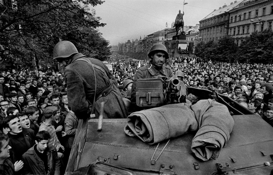
(Josef Koudelka, Prauge, 1968)

Michael Freeman delineates the need for narrative to provide a sense of cohesion in a collection or body of work. Much of the collective written work on narrative in my research, has commented on the relationship between context and subject. In particular, Barthes talks of this interplay as the two central concepts of photography; ‘stadium’ and ‘punctum’ (Camera Lucida: Reflections on Photography by Roland Barthes (1980)). While reading excerpts, in the back of my mind was the old adage ‘fill the frame’, giving all or at least most of the attention to subject either through framing, colour or other photographic means to provide visual punctuation.

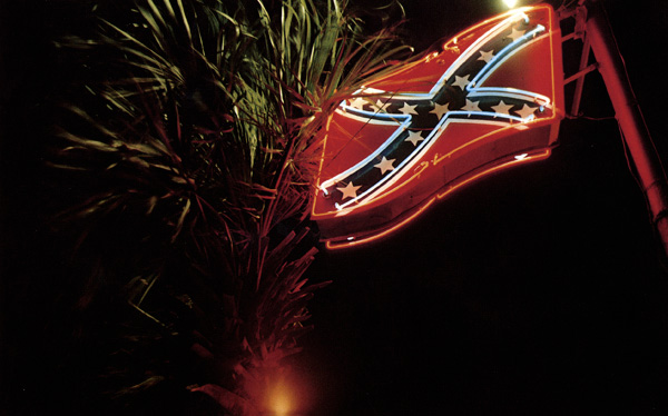
Colour theory we discussed in class and was explored and utilized extensively by William Eggleston (http://www.egglestontrust.com/), something we later investigated following the exhibition at the National portrait gallery (npg.org). ‘Greenwood’, or more commonly referred to as ‘The Red Ceiling’, is a celebrated but prime example of rich saturated colour, a theme which permeates all his work. His influence extended far beyond his own medium, with musicians and filmmakers, such as David Lynch, drawing on the creative outputs of Eggleston. Sean O’Hagan, July 2004, interviews Eggleston with some surprising comments from the artist, revealing someone humble and understated given the impact of his work (https://www.theguardian.com/artanddesign/2004/jul/25/photography1).

eggleston-lacma-bcam-red-greenwood-mississippi

(William Eggleston Greenwood, Mississippi, 1973)

In my follow up research on colour theory I was particularly interested in how colour harmonies (e.g. Monochromatic, Analogous, Complementary, Split complementary, Triadic, Tetradic) can emphasise subject (https://feltmagnet.com/misc/Harmonious-Painting-Color-Schemes , http://www.zevendesign.com/color-harmony-hulk-wears-purple-pants/). McCurry, as a celebrated investigative photographer (http://stevemccurry.com/), uses colour creatively to enhance subject regularly. His most celebrated work, ‘The Afghan Girl’ employs complementary colours from opposite sides of the wheel and to great effect. The modern commercial photographic aesthetic, however, increasingly looks for colour utilized to its fullest effect, in which the entire palette is on display. David Lachapelle in particular (http://davidlachapelle.com/) fills his work with vibrant colour from all areas of the colour wheel in the same shot.

david-lachapelle

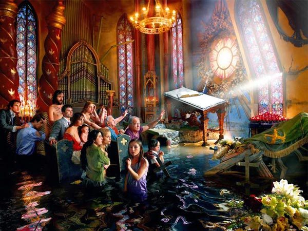
(David Lachapelle, from Delirium of Reason, 2009)

It was clear to me that my first submissions requires a narrative to hold the shots together. Contrast and colour were key elements I was looking to explore, having initially looked at high contrast in test shots and subjects. After so many test shots and scrapped ideas, I decided to put the camera down and reflect on narrative, my research, what they mean to me and attempt putting all these pieces into practice. Eventually resting in a coffee shop, ‘Jailbird’ by Primal Scream was played over the radio and remembered the album ‘Don’t Give Up’. A shot from ‘Troubled Waters’ by Eggleston was used by the band for the CD cover, a happy coincidence and poignant given my search for subject.

troubled_waters_e

(William Eggleston, Untitled from ‘Troubled Waters’, 1980)

Criteria: 1,2,4,5

Lighting and Exposure taken steadily to extreme

Following my initial investigations it was time to start delving into the technical elements of high dynamic range in a single shot, by putting research into practice……

Ansel Adams worked to develop exposure groups in his compositions (initially 10 in total).  These eventually fell into seven zones and gave rise to the celebrated ‘Zone System’.  Many of the modern matrix metering systems used today incorporate similar methodologies by looking at the mean light levels and evaluating light and dark tones.

In my first test shoot, I wanted to explore a cityscape which gave the mood and feel associated with film noir.  To achieve this I was going to shoot in B&W and incorporate a high dynamic range.  Most of the compositions I was not entirely happy with, but my final shot did capture the mood and compositional elements intended (including the deliberate leading lines towards the subject).  A long exposure of 50s and low ISO of 100 at night gave the smooth water effects.  A clear sky would not normally result in an interesting sky/backdrop to a cityscape.  In this case, I think the shot worked, as it added to the high dynamic range.  Unfortunately, however, in my final test image, the highlights are clipped on the right of the image by the river bank.

In evaluation of the shots, and as Farell, Freeman and Peterson specifically comments on, exposing for the highlights in chiaroscuro type images is a must.  If this shot below had been exposed just one/two stops down, the dynamic range would have been better, but more importantly, enhanced ‘The Shard’ further as the subject.  In future, I will look for the highlights, check histogram, but expose specifically for the highlights in the frame.  An unexpected observation was that so much of the work Adams and other rely less on rule of thirds, leading lines etc, but that the viewer is drawn into their subject through very skilled exposure.  That doesn’t mean to say these other elements were absent, far from it, but that exposure was the chief proponent.

Millennium Bridge View 2

Millennium Bridge View 2

A weekend R&R was in order, but of course, stayed calm and took a light camera bag with only a few lenses.  Suffolk was beautiful and fully anticipating great colours and shapes in shots ready to challenge Dykinga.   But really struggled and later realised, forgot the polariser….

My second idea was to capture human interaction with the environment in its most obvious form – farming.  This set of test shots all fell a little flat.  The shapes were all there, but the contrast was not in the images at all, lacking vibrant colour and in the end lead to quite dull subjects.  I could have looked towards the shadows formed by the hay bails really close up and filled the frame or got closer to the machinery and contrasted that with the  natural colour around them.

Later in the evening reflecting on a poor shoot, recalled a group discussion about letting your subject come to you.  Sitting in front of a wood burning stove, with the moon and stars out (with no light pollution), I had natural high dynamic light levels all around me!  Pushing the sensor in the DSLR to pick up stars or the  stove and exposing for the highlights was much more in keeping with looking at high dynamic ranges or extremes of light.  The wood burning stove was an interesting subject to include, I really like the red and black contrasts as well as the moonlight hitting the roof, despite the flare in the lense.  It was an interesting concept to consider, how photography can elicit these kind of responses to our environment, in this case the feeling of heat in low light levels.  The test exposures against the night sky, I suspect is the most extreme test of modern day sensors.   I was not really concerned with composition in the astro shots,  I just grabbed the opportunity as the area did not suffer from light pollution and not often shooting in areas that dont suffer from this.  At ISO1600 or 800 and the fastest wide angle with me being a 20mm f2.8, I had expected quite a bit of noise in the shots.  Was pleased, at least, to pickup the milkyway dust cloud .

Fire Shot 2

Fire Shot 2

In the most recent of my test shots, I wanted explore light as it falls  during the day and exposing specifically for that.  I follow a local photographer, Alex Saberi, given the way he has shot light falling in Richmond park.  While this is a slight deviation from chiaroscuro, I feel its an exceptional use of light to create both contrast and texture in his work, displaying stunning natural beauty of his local environment.  The early morning light in Suffolk did not disappoint and attempted exposing specifically for the light as it passed the leaves in a tree.

Suffolk Morning Mist 1

Suffolk Morning Mist 1

Suffolk Morning Mist 3

Suffolk Morning Mist 3

Despite shooting multiple exposures of the light falling through the trees, the shot ‘Suffolk Morning Mist 1’ did not have the degree of contrast I was after.  Using a good 50mm f1.4. I was exposing for the highlights, but had to stop down in ‘Suffolk Morning Mist 3’ to get the mist and murky atmosphere.  Plenty of followup work and practice here for me to really take this forward.

References:

  1. Adams, A ‘The Camera’ (Bullfinch Press, 2003)
  2. Adams, A ‘The Negative’ (Bullfinch Press, 2002)
  3. Adams, A ‘The Print’ (Bullfinch Press, 2006)
  4. Freeman, M ‘The Photographers Eye’ (Focal Press, 2007)
  5. Farrell, I ‘Complete Guide to Digital Photography’ (Quercus, 2014)
  6. Langford, M ‘Langford’s Advanced  Photography’ (7th Ed., Focal Press, 2008)
  7. Langford, M ‘Langford’s Basic  Photography’ (10th Ed., Focal Press, 2015)
  8. Peterson, B ‘Understanding Exposure’ (3rd Ed., Amphoto Books, 2010)

Criteria: 1,2,4,5

The first project brief – a surprising journey.

Finally putting pen to paper (or posting documented blogs) to chart my research and development of ideas.  After a weekend of blood sweat and tears fighting with wordpress, its inconsistencies and touchy UI personality, I’m delighted that the very basics of presenting posts are happening, albeit not as aesthetically pleasing as I would wish.

I’m left feeling that the focus of the brief of project 1 “People and the environment” for lense based image making, has actually led to question the very heart of photography in a meandering journey, leading pleasantly afar, to an unexpected place.  Group discussions and investigation has actually pushed me to challenge some fairly basic principles in the medium, some of which I have taken for granted for a very long time.  I suspect these concepts are well established for the group, but for me they are not.  Where to start, sadly not at the beginning…

“People and the environment” – the brief.  Beautifully vague, deliberately broad and discovered fairly quickly, absolutely pointless trying to define.  Do we mean the environment or people or people in the environment, tangible or intangible or somewhere in a varied spectrum between all of these?  Of course it can mean all/some of these things and more, such as human impact on the environment.

In looking at the works of well celebrated photographers, such as Ansel Adam or Annie Leibovitz, something struck me about all their work and indeed all the photographers I follow closely.  My attraction was to photographic artists who’s shots incorporate a high dynamic range (not to be confused with HDR processing) and high contrast images as seen in the classical Chiaroscuro works, or so I thought (e.g. Derek Hudson).  Michelangelo and Leonardo da Vinvi incorporated the use of extreme light and dark in some of their works, as categorized in post modern commentary as ‘Chiaroscuro’ such as ‘The Virgin of the Rocks’ or ‘Head of John the Baptist’ in the National Portrait Gallery.

A simple google search for the uninitiated will reveal Chiaroscuro still alive, well, and kicking aloud many hundreds of years later by Hernán Piñera and Olivier Bain (http://www.thephotoargus.com/35-gorgeous-examples-chiaroscuro-photography/).

The same conceptual elements are regularly heralded in other art forms (http://www.criminalelement.com/blogs/2011/05/masters-of-darkness-and-light-film-noirs-unheralded-geniuses).

For several weeks I have been grappling with the dichotomy of the brief on the one hand, with the approach taken behind those images I’m drawn to the most on the other.  Conclusions have poised on the unaccredited quote (certainly not mine) and the technical & creative precipice which awaits me, following –

“Masters of photography are the masters of light and composition”

This appears to be a universal truth for those images I’m naturally drawn to.  As I revisit my research, this same concept is present at each and every turn.

In sum, my research for the brief has lead me to question the core of photography for those I admire and whose images I am naturally drawn to.  Each and every one skilfully craft with masterful use of light, irrespective of genre.  My interpretation of the brief is therefore simplistic, the environment around us, but employing those extreme uses of light seen in so many photographers work, even on my door step: (http://www.alexsaberi.com/).