CT – Cruel and Tender – Submission

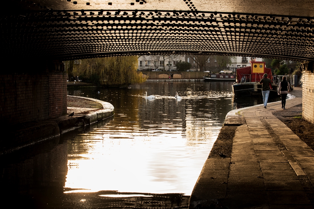
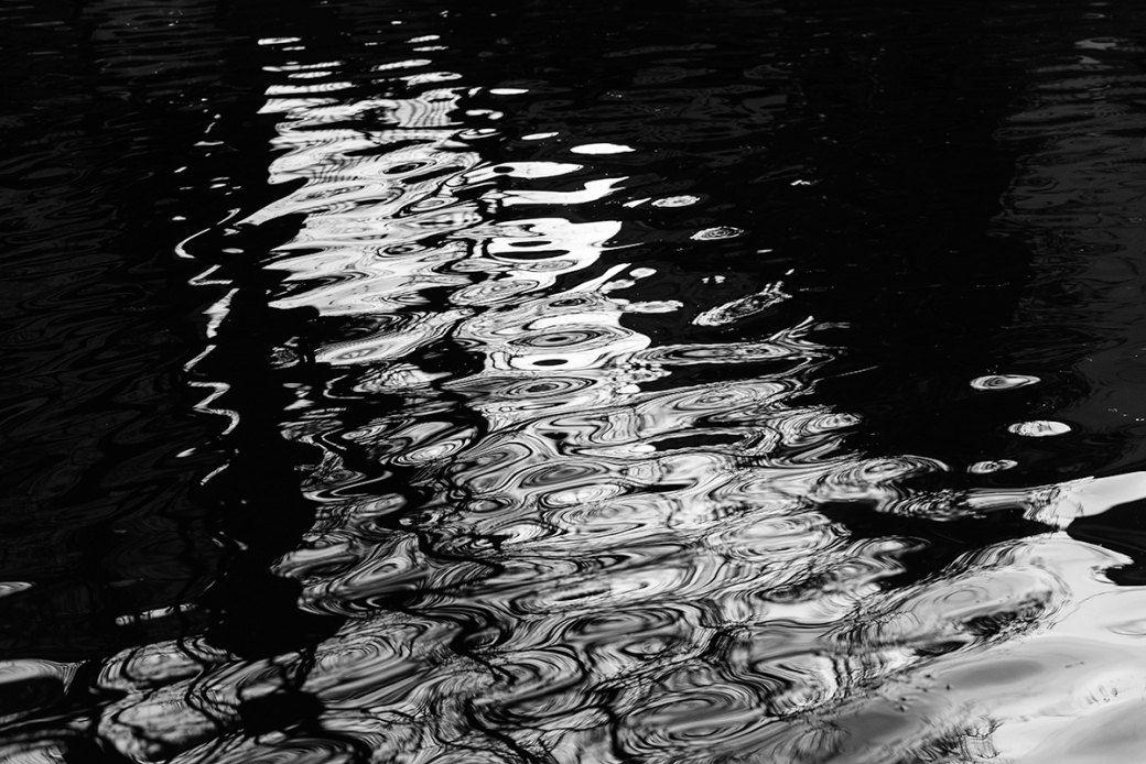
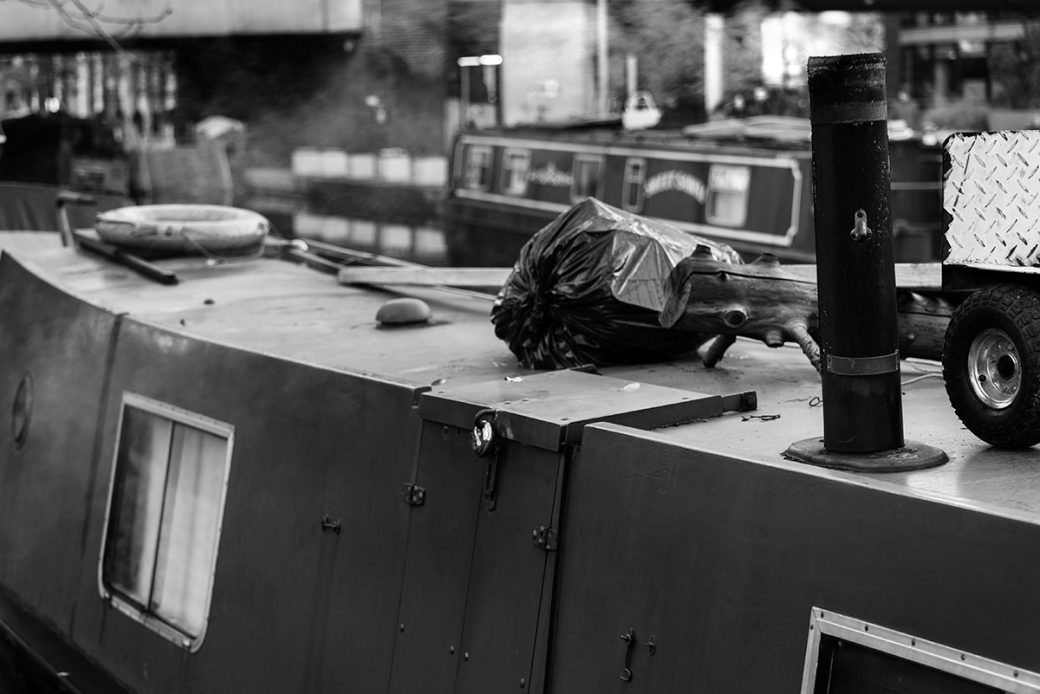
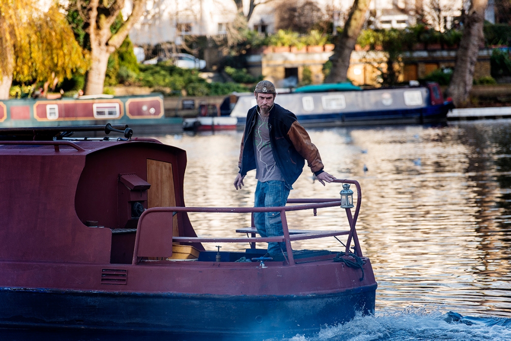
Cruel and Tender – Location Submission – ‘Reality in Richmond’
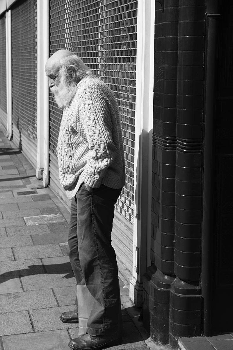
For the location submission, I decided to shoot in black and white.  In the first term the work of Adams and matrix metering came up in various discussions and having followed his work, decided to move away from colour for the final set of images.  I felt it was more in keeping of the styles of both Evans and Patzsch.

Evans
I was mindful of the advertising as well as people and places of work in the images of Evans and wanted to incorporate these into the subject of the shots I took.

BtecLv3_P2_Sub3_f

BtecLv3_P2_Sub3_e

BtecLv3_P2_Sub3_b


Patzsch
Clean lines, form and texture were the components I was looking to incorporate into the shots around the Richmond area.

BtecLv3_P2_Sub3_d

BtecLv3_P2_Sub3_c

BtecLv3_P2_Sub3_a

BtecLv3_P2_Sub3_g

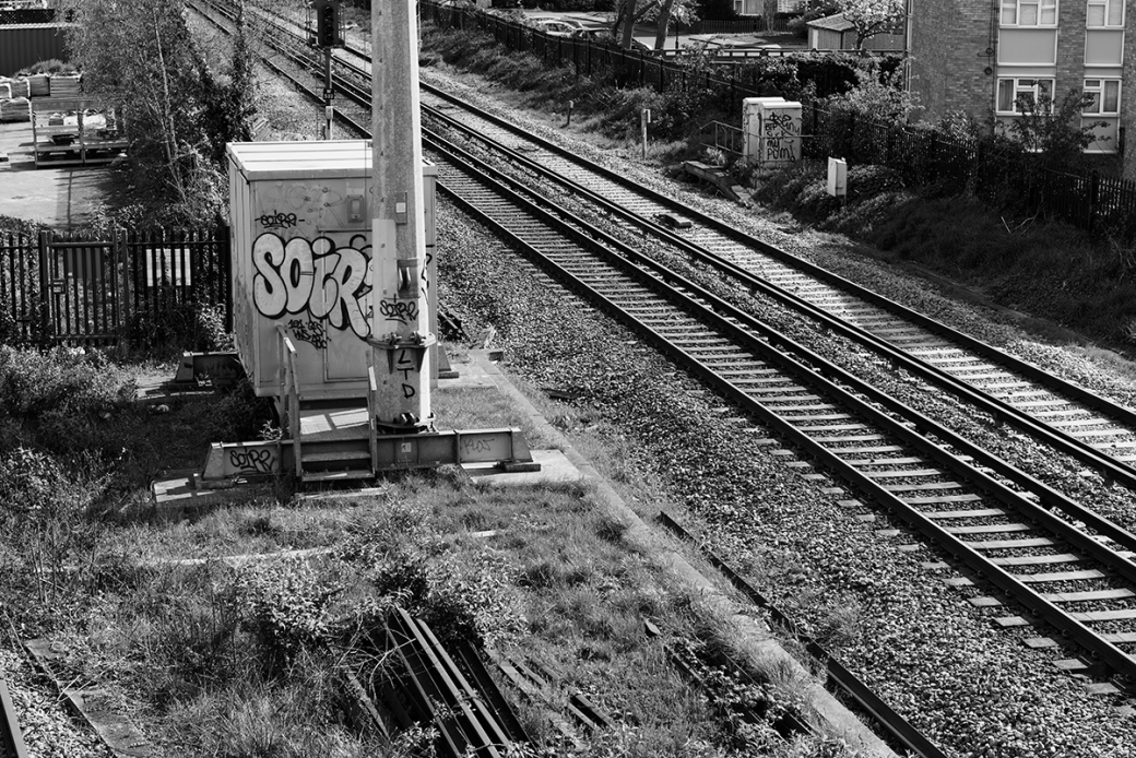
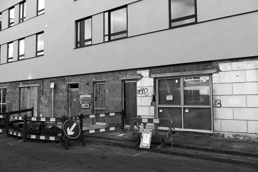
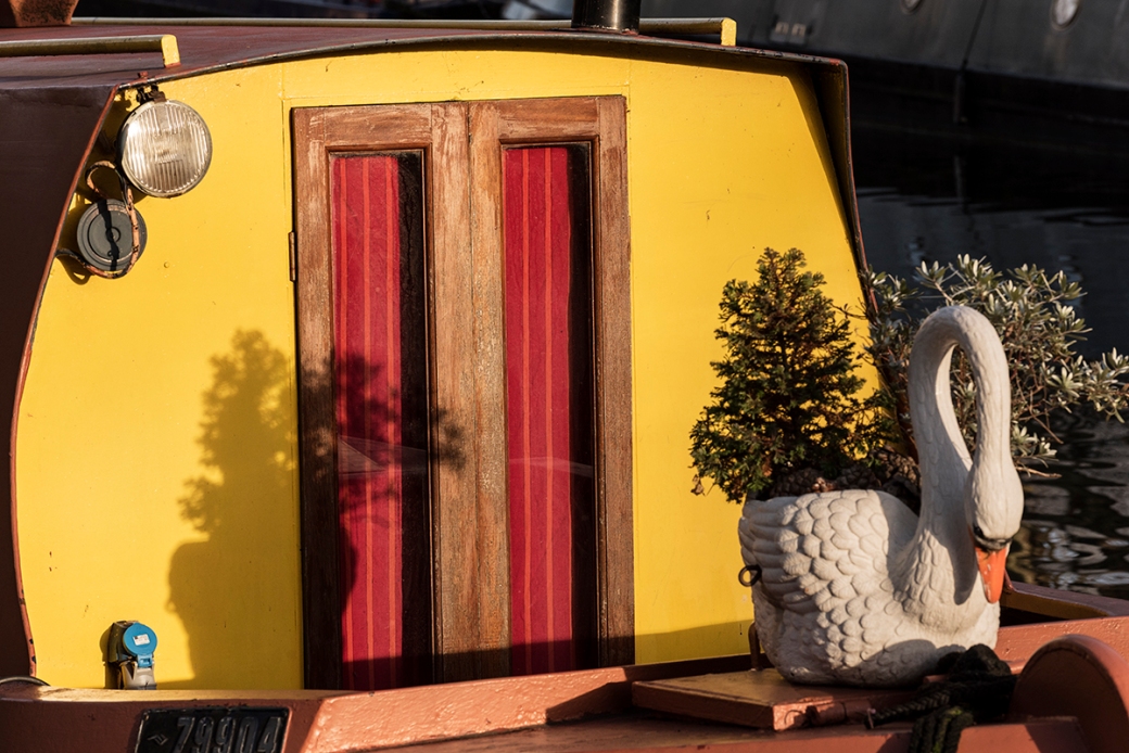
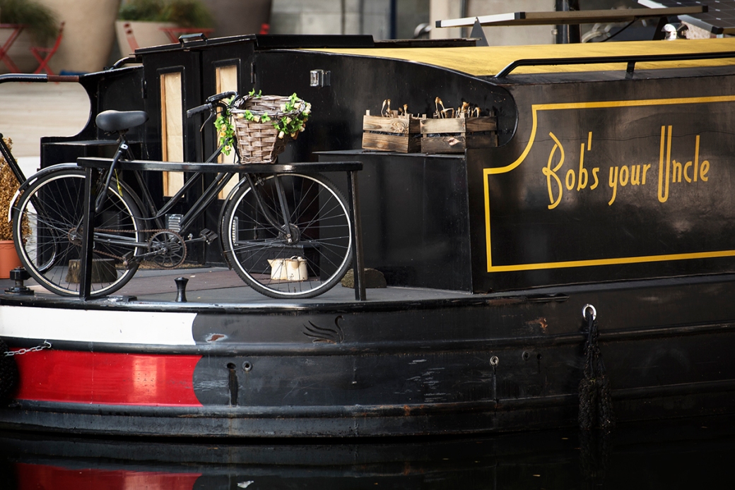
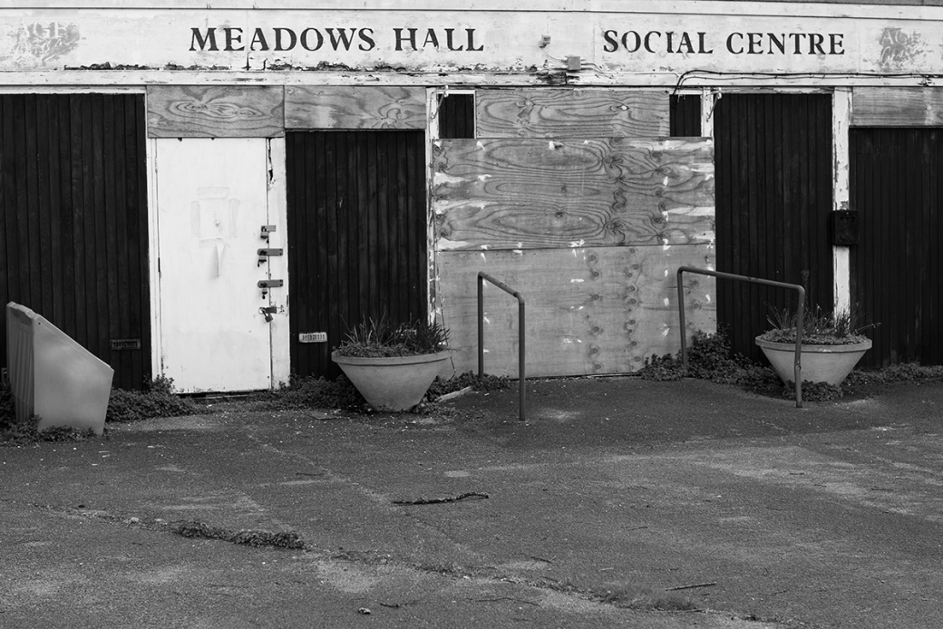
All these shots were taken using a 24 – 70mm f/2.8 lens, but had considered using a fast 50mm standard lens.  I have come to appreciate the flexibility this lens can give me as well as the clarity and detail in the final result.  Technically I did not feel the location shoot posed the same challenges of the studio work.  There was one exception, being the building shots of the advert and flats in which there was some barrel distortion.  I have not posted a few of the images from the location shoot, which were excluded from the final seven.  These showed homeless people living in tents around Richmond.  I didn’t feel comfortable posting these and really were a little out of keeping of the rest of the shots and the brief.  Throughout his term I have had to increasingly become familiar with post production software and the final submission probably saw me employ more knowledge gained from this experience than the prior two.  I remedied to some degree the distortion in two of the images in post production but also employed adjustment curves to enhance contrast across all the images in the location shoot.

Evaluations on Submissions
On the whole, I am pleased with the submissions across still life, studio and location for the term.  Still life technically was very challenging, balancing a very long shutter speed to capture the laptop lighting.  This was a step beyond what we had originally experienced using studio lights and adjusting those to the manual settings to expose correctly.  I did feel the overall image (Information Wars) didn’t quite have enough light on the subject, despite the rest of the image being lit as it should. A greater understanding and knowledge of post production could have helped me here, but I think its going to be an area I will need to work on in the third term.  The semiotic elements and interpreting the brief for the first shot did go according to plan and think I employed the facets of classical still life paintings in a modern set.  The printing for the submission was in gloss, deliberately, as the light reflections would have helped the mood of the subject, matt was not really in keeping with the atmosphere of what I was looking to create.  Health and safety was a concern here, given the number of power cables from not only the lights but the laptops in use.  Holly is the H&S guru here, she made sure we were all very careful.

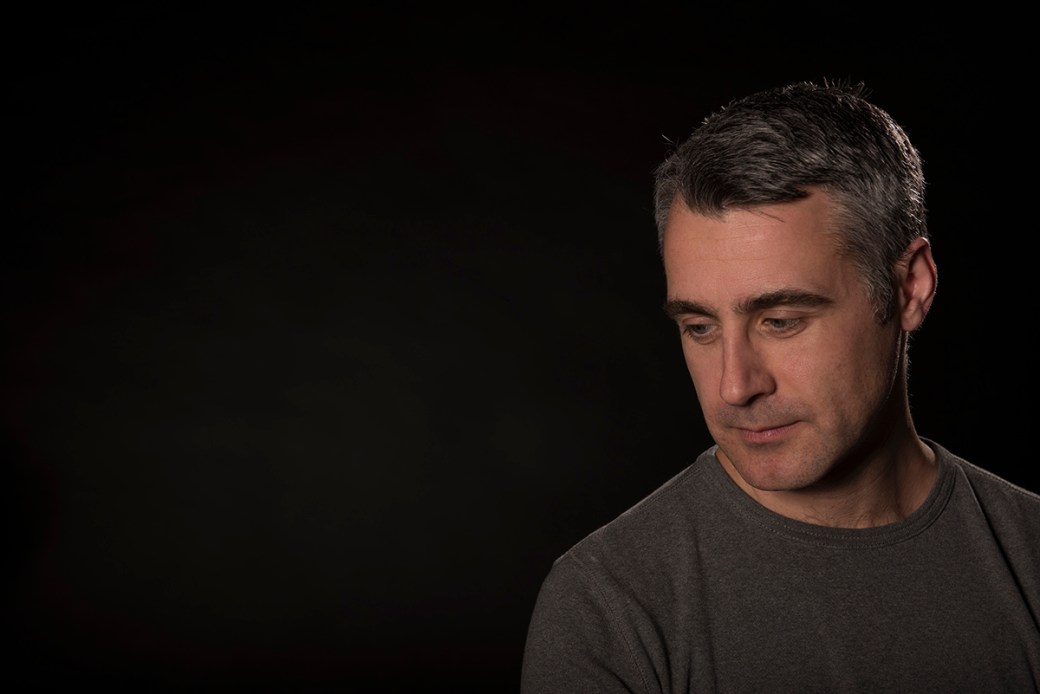
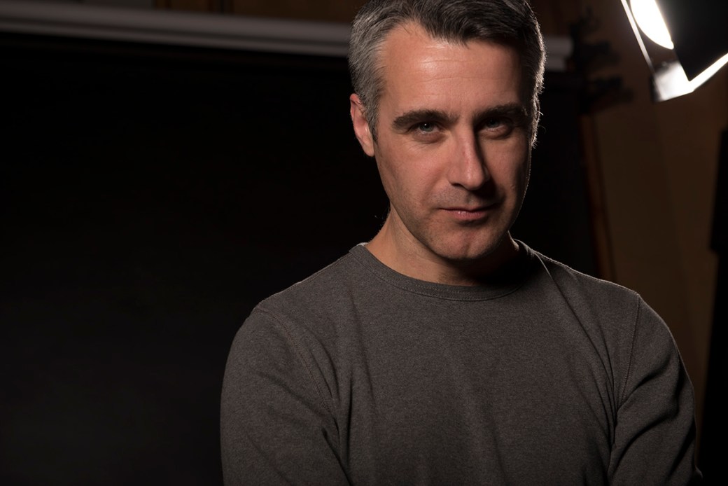
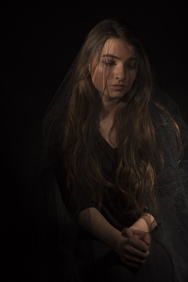
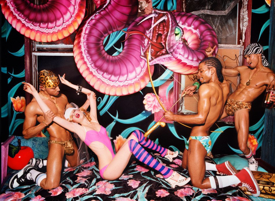
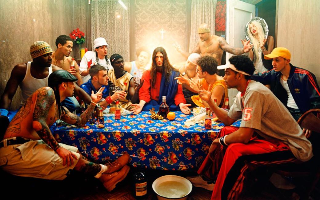
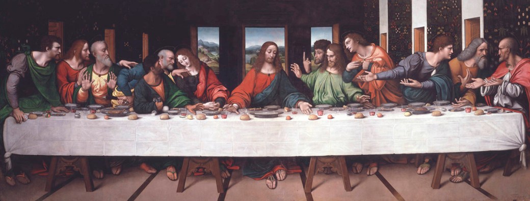
The studio submission (Apotheosis) was also a technically demanding image, with 6/7 lights in the studio involved in the group portrait.  Again I think the brief was hit, taking classical portrait, in this case the last supper, but applied in a modern way.  It is fair to say I have been heavily influence by LaChapelle, but was ready to acknowledge we could not incorporate the diversity of props into the set.  It was a shoot I will not forget, everyone had fun and and enthusiastic to be apart of it, for which I am very thankful.  Health and safety was covered carefully in the shoot, we had rearrange most of the desks to build the set.  I did feel the white background could have produced a far better image, but the back was too bright in comparison to the foreground and had parts of those images clipped.  The black background did expose better and across both backdrops the gels worked well for me, adding to the dominant colours of red, blue and fuchsia.  I am disappointed with the final print, however, I had requested from the printers a matt finish and double the size of what we exhibited at the end of term.  There was just not enough time to have it reprinted.  As a follow up I think I am going to look to shoot against a white background again next term.

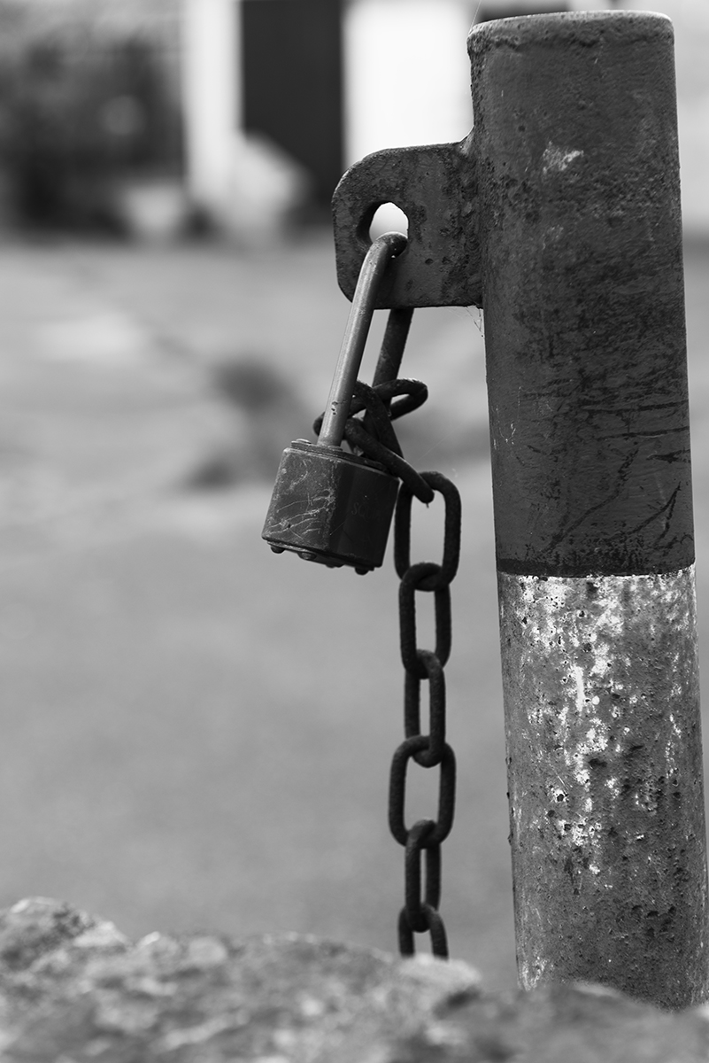
The location shoot I felt was the best of all three submissions.  Last term my images didn’t say anything in the submissions, but feel the subjects in all three shoots have said more.  There was a subtlety to the final images in this respect, I think if I had gone down the journalistic route of making a very topical statement, it could have missed the concepts of ‘Realism’ evident in the ‘Cruel and Tender’ exhibition.  Really enjoyed post production on these images as well, turning into B&W and using adjustment curves to enhance contrast.  Of the seven images, I think the padlock was the weakest and nearly left it out completely.  What interested me though, was the lock was in use, but the chain was not at all, kind of ironic for the area.  Patzsch covered so many diverse subjects, it also felt right to include it, even if the image itself is a little disappointing.  The prints were also the better of the submissions.  Adding a small white border to the gloss prints made the texture and contrast jump out.

Overall a good term, with improving choice of subjects.  Post production has been a real weakness of mine and if I want to improve the final result of my work, this is the next area I need to focus on.

Criteria 1, 2, 3, 4

CT – Cruel and Tender – Location Research

When given the title for the second project, I immediately assumed the subject had some element of the paradoxical about it, that some very harsh aspect of reality inherent to our submission for the location element was part of the brief. Given the ‘Cruel and Tender’ exhibition was first shown in 2003, the reviews written at the time and critiques at the time was going to be a key source of information for research into whatever I was going to shoot. My initial ideas were to take some journalistic photographic approach to animal cruelty. While the ideas associated with the ‘Cruel’, animals being found in distress and the ’Tender’, their recovery, would be a very graphic and relevant subject, the insurance policies of all the charitable foundations I approached would not allow a visitor to be on location when rescuing distressed animals. This first idea was not going to work without the ‘Cruel’ aspect and so moved on.

The ‘Cruel and Tender’ exhibition was really an expose on ‘Realist’ photography, with a huge domain of photographers being exhibited, including:
Robert Adams, Diane Arbus, Lewis Baltz, Bernd and Hilla Becher, Philip-Lorca diCorcia, Rineke Dijkstra, William Eggleston, Walker Evans, Robert Frank, Lee Friedlander, Paul Graham, Andreas Gursky, Boris Mikhailov, Nicholas Nixon, Martin Parr, Albert Renger-Patzsch, Thomas Ruff, August Sander, Michael Schmidt, Fazal Sheikh, Stephen Shore, Thomas Struth, and Garry Winogrand.

Walker Evans’s depiction of mundane American life was juxtaposed with harsher depictions of suburbia by William Eggleston. The title ‘Cruel and Tender’, came from a critic of Evan’s work in which it was described as handling a cruel subject tenderly. This surprised me, as many of the early photographers being exhibited were showing ‘Reality’ not necessarily the harsh paradoxical views I had assumed at the very start of the term.

My idea was to take location shots of Richmond, but depict the realities of what can be seen here, rather than the affluence commonly connected with the area. Two photographers in particular influenced me from the initial exhibition, Walker Evans and Albert Renger-Patzsch.

Walker Evans showed real mid-town America, documenting the effects of the depression while working for the Farm Security Administration. In the examples I have posted here, it was interesting to me that he focused not only on working families but the commercialism of the time, including adverts and places of work to a backdrop on the time of the economic depression.

Albert Renger-Patzsch subject matter was very wide ranging, including still life, architecture, portrait and other photographic genres including a recurrent fascination with trees. Patzsch work struck me probably the most, I really liked his approach to form in his images. Clear shapes and distinct lines are visible in all his work with a great sense of texture.


So my research had led me to take a ‘Realistic’ look at Richmond, with less emphasis on the paradoxical. Technical challenges would start with actually finding subject matter which could show this concept, but also embody the stylistic elements of both Evans and Patzsch.

Criteria 1, 2

References:
http://www.tate.org.uk/about/press-office/press-releases/cruel-and-tender-real-twentieth-century-photograph
http://www.contemporary-magazines.com/reviews56_1.htm
http://www.domusweb.it/en/design/2003/07/02/cruel-and-tender-20th-century-photography-at-tate-modern.html
https://photoworks.org.uk/cruel-and-tender/

CT – Studio Portraiture – Test Shots and Submission – Group

Following on from research and test shots for individuals, the group shots were going to be far more challenging. The set composed, 2 back light gels (purple and blue), 2 studio lights with softboxes, a spot light and a hand held speed light. The class all brought coloured clothing agreed ahead of time. I wanted to use reds, blue and fuchsia within the colour palette. Complimentary colours of green and orange were also in the mix, to exemplify the same use of colour by LaChapelle. We were never going to recreate the same diversity or use of props seen in the last supper, but it was our take on a classical group image.

I continued using the 24 – 70mm f/2.8 lens, manually shots at ISO 100, f/7.1 1/200sec. Pulling the group closer to the table and the lights was a necessity as the first few shots were very dark and not well lit. The skin tone mix was also tricky as the reflected light was going to alter through the shot.

Group Shot
Despite the technical elements of the shot we did get some interesting final images using both black and white backgrounds:

Outtakes
I think everyone enjoyed the shoot and grateful for everyone taking part so have included some outtakes from the session:


The final image selected for submission was the shot which I felt had the right balance of exposure and correct pose.  The framing throughout the shoot was actually the most difficult aspect.  I tried to get the table in shot as much as I could, but think we ended up with a more intimate group shot.  The exposure was as I wanted but disappointed the white backdrop could not be used as the pastel colours worked, but the highlights were just too far gone.  As a follow up next term, another studio shoot with a white background would be interesting, as it was harder to shoot compared to a black background and wasn’t happy with the balance of lighting in the first half of the shoot.

Apotheosis:

Sub2

It was a great shoot and delighted that despite the number of studio lights required it came together.  Wont forget this studio session everyone had fun taking part.

Criteria 1, 2, 3, 4

CT – Studio Portraiture – Test Shots Single Portrait

Session 1: Side lighting and chiaroscuro
The studio test shots for individual portraits were over two separate sessions. In the first, Jason modelled for Louise and I. The spot lights were set with barn doors and instead of using normal ISO 100, 1/200 sec, f/7.1, I stopped down 3 stops to expose for the highlights and experiment with halo and side lighting effects (Grey, 2004). Having used a 105mm in prior shots, I wanted the flexibility to frame more easily so used a 24 – 70mm f/2.8. We followed up with a spot light on slightly lower power with open barn doors for the first of my portrait shots:

CT Portrait TS 3a

CT Portrait TS 2


CT Portrait TS 1


Holly modelled in the same session in which we varied a studio light with a soft box and a reflector. I really liked the effect of shadows in the final result, a warm skin tone really came through in the final images (Perkins 2006), shot with aperture back at f/7.1:

CT Portrait TS 5

CT Portrait TS 4a


Session 2: Softbox and spot light
In a second session in the studio, Paula’s portrait shoot was underway. we looked at the effects of drapes and netting in the shoot. The power settings for the studio lights were much higher than in previous shoots and needed to top down one or two stops to expose correctly. Soft box and reflectors were in use in these shots:


CT Portrait TS 8

CT Portrait TS 7

CT Portrait TS 10

I was pleased with my first portrait test shots, exposing correctly for the images and adjusting lighting as needed.  I really wanted to shoot more side lit and highlight shots, but we ran out of time.
Criteria: 1, 2, 3, 4

References:
Grey, C. ‘Master Lighting Guide for Portrait Photographers’ (Amherst Media, 2004)
Montizambert, D ‘Creative lighting Techniques’ (Amherst Media, 2003)
Perkins, M. ‘Professional Portrait Lighting: Techniques and Images from Master Photographers’ (Amherst Media, 2006)
Tuck, K ‘Minimalist Lighting: Professional Techniques for Studio Photography’ (Focal Press, 2009)

CT – Studio Portraiture – Research

The studio portraiture was, like the still life, new for me in the sense this is a departure from what I would naturally shoot and prior to this term, had not shot in a studio or with lighting other than speed lights. I conducted a lot of research for the still life, but my inspiration for the studio portrait shoot was something I found while looking into professional photographers during the first term. I discovered a photographer for whom I have come to greatly admire, David LaChapelle. His use of vibrant colour has produced some of the most vivid images in modern culture:

Deluge (Deluvio):
Deluge

Guilty Things:
david-lachapelle-guilty-things

Last Supper:
DavidLC LS

Leonardo da Vinci’s Last Supper:
Giampietrino-Last-Supper-ca-1520
LaChapelle’s interpretation of The Last Supper was for me one of the most striking images I have seen in the collective research from both first and second term. The Last Supper has been reworked so many times, I knew that any interpretation I may make would fall into the cliche of so many other reworked images of its kind. The shoot would be limited to the materials in the studio we could use and I would not be able to have such diverse texture and colour in supporting props as LaChapelle. Significant more technical challenges were posed in a group shoot compared to a single portrait in controlling so much lighting in the studio effectively. Despite the challenges, I was the only person doing a group shoot and felt a great way to get the entire class involved in a single shot.

I started test shots with simple lighting for individual portraits.

Criteria: 1, 2

References:
Childer, J., Galer, M. ‘Photographic Lighting Essential Skills’ (4th Ed., Focal Press, 2008)
Kelby, S ‘Light It, Shoot It, Retouch It: Learn Step by Step How to Go from Empty Studio to Finished Image’ (New Riders, 2015)
Montizambert, D ‘Creative lighting Techniques’ (Amherst Media, 2003)
Perkins, M. ‘Professional Portrait Lighting: Techniques and Images from Master Photographers’ (Amherst Media, 2006)
Prakel, D ‘Basics Photography: Lighting’ (AVA Publishing, 2007)
Tuck, K ‘Minimalist Lighting: Professional Techniques for Studio Photography’ (Focal Press, 2009)
http://davidlachapelle.com

CT – Still Life Short list and Submission

In researching the work of Leo Acker and other commercial photographers such as Adrian Muller I was interested to compare the lighting used with that of the test shots.  Most are very well lit as was Paula’s set, however, I was planning on something very different for my still life.  After feeling very comfortable technically with a variety of test shots in the  studio, I wanted to use the lights from laptops to illuminate the set.

It was important for me to grow and challenge myself this term both in technical terms but also for my shots to say something.  In my still life, the current political climate and information wars held over multiple continents was my theme.  To challenge myself further, I would not be using studio lighting, instead opting for the light emitted from laptops to illuminate the set.  This poses numerous challenges as I would need to shoot at below 1/60sec for to capture light from the screen (refresh rates are normally 60 Hz), which means camera shake needed to be controlled.  The shoot was going to need tripod and shooting cable.  Additionally, I wanted to use a wide angle zoom lens (Nikkor 18-35mm f/3.5-4.5 AF ED), which was to ensure I could frame more accurately and have the flexibility to grab the scene as I wanted.  f 3.5 is not super fast, which was going to mean shooting well below 1/50sec.

Louise and Holly really helped with the shoot, as it took far longer to setup and get the shot than anticipated.  Holly was particularly mindful of health and safety, given the number of extension cables and electrical items in the set.  We were all very vigilant in this area….I did experiment with studio lighting in the shoot, but the atmosphere and overall effect were just lost.  The final image I was much happier with, which was taken at 1/15sec, f/11 (wanted a relatively deep depth of field), fully lit by the computers in the set.

Information Wars


CT Still Life Sub

Technically, I was really pushed in this shot, touching on long exposure photography in the studio and running out of time!  The final result was pleasing with some editing in camera raw, to adjust exposure just slightly.  A wide angle zoom really helped with the framing of the set and colour balance was set correctly this time.  The surface appearance of the metal in the hard drive I wanted muted and Light: Science and Magic has an entire chapter dedicated to metal in surface appearance.  The draped flags going from dark lighting into dark edges of the image I feel has worked well.

My modern take on still life is really a reflection of what I see as happening in the world today and a nod to the Dutch Masters use of semiotics in still life, as they inspired me to think symbolically of  our geopolitical climate.  Im pleased that I was able to shoot what I envisaged and say something.  Its definitely not to everyones taste, but last term struggled to say anything in the medium.  Vincent Borrelli cropped up in one area of my research and was so impressed with how he communicates in his images.  I don’t think this image leaves room for doubt as to what its communicating.

Criteria: 1,2,3,4

References:
Langford, M ‘Langford’s Advanced Photography’ (7th Ed., Focal Press, 2008)
Hunter, F., Biver, S., Fuqua, P. ‘Light: Science and Magic’ (5th Ed., Focal Press, 2015)

CT – Still Life Test Shots

It was great to be involved in the various shoots of the entire group during the second term. This gave us all the opportunity to practice in the studio. It was also the first time I had used transmitters, with multiple fixed standing lights, having only used Nikon speed lights up to this point.

All my shots in the studio were taken in manual, ISO 100, SP 1/200 at f/7.1. Lighting using various combinations of soft boxes and direct lighting while were used and adjusted power to the needs of the subject. In my early shots I was interested in seeing how different focal lengths would affect the image and the depictions of the material and using a stronger side light, which would introduce shadows, something modern still life tends to avoid (Freeman, 2007). The side lighting was apparent in the early still life paintings of Pieter Claesz’s Still Life with a Skull and a Writing Quill, 1628, but most paintings in my research were front lit (CT – Still Life Research).

After a series of practice sessions, I really liked Paula’s idea of food and in particular the set for pasta.  I joined her in helping setup and practice shot with a longer focal length than I expected to use for my shoot (here 105mm DC NIKKOR f/2, normally a long portrait lens).

I was quite pleased with these first shots, but really noticed how framing was going to be very important irrespective of the focal length involved; here, it helps to focus on the subject rather than take the whole set in:


While we were shooting I became acutely aware the white balance on my camera was off.  Something I hope to learn more about is post production and only recently started looking at techniques in image software production.  This would have to be corrected later.

In these images the framing was off, but the side lighting resulted as I expected, with shadows working in the scene.

The last few shots came out a little better, after turning up the power on one light (soft box attached).  I also edited these images for better white balance and felt this was a good start to test shooting still life in the studio:

Still Life TS 4

Still Life TS 5 copy

Before starting in the studio, spent some time reading Light: Science and Magic.  Many of the lighting concepts in still life were covered initially from the reading last term (Freeman, 2007), but not nearly at the depth needed to understand the placement of objects, overall lighting, surface appearance, shaping and contrast.  Softer lighting here really helped with the surface of the eggs, but not to the extent that the image was blown out.  The histogram on all these shots was full with no clipping – very pleased the exposure kept highlights and shadows from being burnt from digital negative.

Criteria: 1,2,3,4

References:
Freeman, M ‘The Photographers Eye’ (Focal Press, 2007)
Farrell, I ‘Complete Guide to Digital Photography’ (Quercus, 2014)
Langford, M ‘Langford’s Advanced Photography’ (7th Ed., Focal Press, 2008)
Langford, M ‘Langford’s Basic Photography’ (10th Ed., Focal Press, 2015)
Hunter, F., Biver, S., Fuqua, P. Light: Science and Magic (5th Ed., Focal Press, 2015)

CT – Still Life Research

Semiotics
The use of signs and symbols have been prevalent in global cultures for millennia, an interacting devise of communication stemming from the human condition and its consciousness. The two part process of interpreting the world around us and then describing that interpretation with symbols, either through obvious or subtle & coded messages, touches on so many areas of our lives today as it has through history. It’s therefore no surprise Semiotics recurs through many academic disciplines; linguistics, dilectics, religion, art history, philosophy, branding, cryptography, musicology….

So diverse is Semiotics, that for some there is no other way of communicating, such as Robert Schumann’s musical sphinx to Clara in his piano concerto 1845, following being committed into an asylum and denied access to his wife or family. What interests me even more is the human desire is so strong to solve codes and understand symbols, the entire process is self perpetuating. An endless cycle. The need for us to form patterns and make sense of them, moving from high to low states of entropy, doubtless will ensure Semiotics endure, never to leaves us (The Posthuman Condition, Pepperell, R., 1995).

Pictorial Semiotics I found a really interesting facet of material related to classical still life paintings. This was the source of inspiration for the first of three submissions in the second term. With a heavy emphasis on the technical elements of studio flash photography, the use of light is a fundamental feature of both classical art and the ultimate submission. To grow and develop my photography I was keen this term to say something through the submissions within the context of the brief.

Semiotics in Still Life
Early Northern European classical art focused on religious ideology and the Vigrin, with the lily symbolizing purity, but rapidly incorporated moralizing symbols such as vanity and desire for material things (Met Museum – Northern Europe).

Still Life with Lobster and Fruit, Abraham van Beyeren:

Vanitas 2

Digital Photo File Name: DP143207.tif Online Publications Edited By Steven Paneccasio for TOAH 12-18-2015

More vivid examples of opulence in still life I found in examples like Adriaen van Utrecht, Pronkstilleven:

Banquet_Still_Life,_Adriaen_van_Utrecht,_1644_-_Rijksmuseum
Harmen Steenwyck ‘Still Life: An Allegory of the Vanities of Human Life:

allegory_of_the_vanities

The vanities in human life are expressed through Semiotics, the passing of life – birth and fertility (shell), death (chronometer, skull and extinguished lamp), luxury (musical instruments, books, silk). ’Vanitas’ symbolic art work of the 17th century in Northern Europe is littered with depictions of skulls and quills (Jacques de Gheyn II’s Vanitas Still Life 1603, Pieter Claesz’s Still Life with a Skull and a Writing Quill, 1628):

Vanitas a1

Working Title/Artist: Cup Department: Islamic Art Culture/Period/Location: HB/TOA Date Code: Working Date: 9th-10th century Scanned for Collections

Vanitas 1

Working Title/Artist: Still Life with a Skull and a Writing Quill Department: European Paintings Culture/Period/Location: HB/TOA Date Code: Working Date: 1628 photography by mma 1979, transparency #3c scanned and retouched by film and media (jn) 8_7_03

Similarly, the briefness of life is also depicted in Vanitas with Violin and Glass Ball Pieter Claesz:

1024px-Pieter_Claesz._-_Vanitas_with_Violin_and_Glass_Ball_-_WGA04974

Claesz incorporated a self portrait in the glass bowl, making this particular still life stand out. His work also captured the four elements, earth (skull), fire (candle holder), water (glass) and air (feather). The fragility and speed of life’s passing, with warnings against materialism and over indulgence, are ever present in many of the still life subjects in Northern Europe, echoed in the art of Souther Europe (Met Museum – Southern Europe).

Through my research I was really struck by ‘Allegory of Charles I of England and Henrietta of France’, Carstian Luyckx:

Allegory of Charles I of England and Henriette of France in a Va

The same themes of life and death are present, given Charles was beheaded at 44 years old. What I really liked was the very obvious statement of what hunger for power and glory can do to an individual, in this case enveloping Charles’s mortality. This was the first example I had seen in which power and politics on a global scale was memorialised. I did not find too many further examples of this in my research, but felt something I wanted to explore in the studio. All the examples I looked at referred to the issues relevant at the time, so while they may appear dated now, there was especial meaning attached to the subject and semiotics of these still life pieces.

The decision was made, I would portray a modern depiction of current power struggles in the form of still life within the studio.

Criteria: 1,2

References:

http://oxfordindex.oup.com/view/10.1093/oi/authority.20110803100326357
http://www.journal18.org/issue3/nautilus-cups-and-unstill-life/
http://www.metmuseum.org/toah/hd/nstl/hd_nstl.htm
http://www.metmuseum.org/toah/hd/sstl/hd_sstl.htm

People and the Environment – Living on Water in an Urban Landscape – Submission

In describing the selection for my submission, I am looking to evaluate my progression in the three concepts of narrative, contrast and colour.  I don’t feel my work can be placed against the artists I have researched, I don’t posses the skill or experience of these artists, but will evaluate how I have used the understanding and inspiration I have gained from them.

Narrative has been my weakness through the whole project, with so many test ideas explored I started focusing on technique rather than subject.  This really held me back through the opening weeks of test shots.  As I examined the works of other artists, the skill and thought put into their respective collections to create cohesion and narrative appears deceptively simple, but in practice is far from easy.  Above all else, I wanted my submission to have a narrative and be cohesive. The selection was helped by my class mates and agreed with them.  I believe the collection stands together with a concurrent visual theme:

Without doubt my favorite image and most challenging to shoot was the bridge.

lvl3-p1-lbim-w9a

Adams, in my very early research, looked to capture exposure and contrast in his images with astounding skill and artistic poise.  The bridge shot has a large dynamic range providing natural vignetting, but liked the texture of its underside being reflected in the water with strong colours of red and yellow from the barge which make it stand out.  Technically this was the most demanding shot of all, particularly as the passers by could have been out of shot quickly while setting the correct exposure.  I wanted as much in focus as possible so stopped down to increase depth of field, but had to adjust shutter speed to capture motion.  Contrast and colour come through in this shot and overall very pleased with the image.  Making greater use of filters (polarizer) may have helped with the muddy mid ground water and possibly waiting a second for the walkers to have followed the path for second later may have balanced the image better (Cartier-Bresson, capturing the fleeting moment).  I like the scene this image sets, with a clear introduction to subject matter of urban life in the background and waterways in the foreground.  The shot of the three swans and three children was excluded as really both shots were a similar subject and the bridge I felt was a better shot and stronger composition.

Conveying subject was key to narrative and was pleased with the image of the water.

lvl3-p1-lbim-w8a

Images of water can be quite bland and so decided to move this into black and white to give the shot greater contrast, with a more ephemeral and abstract feel.   This image is quite central to the narrative and took at least fifteen shots while on location.  Exposing for the highlights was my aim and ultimately achieved what I was looking to capture.  Initially I had hoped the grittier, harsh realities of living on water were all going to be conveyed in black and white.  I deliberately left out the shot of the water bottles, despite the importance of their message (the irony of not having fresh running water while living on a barge).  In both colour and black and white the shot was poorly framed and lacked impact.  Koudelka placed his subjects in context for maximum impact and this image had no context at all.  If I had broadened the shot to include more context and focused on the reflection more, the water bottles shot may have been usable.

The harsher side of living on water was better captured by the smoking barge:

lvl3-p1-lbim-w6

This image I debated including for some time.  In isolation I don’t feel the image is strong.  Again, it has a high dynamic range, with deep blacks in the funnel extending to the highlights in the background giving significant contrast.  The framing and angle of subject lets this image down, however, with a more sweeping angle of the barge and the rubbish and wood more off centre it probably would have worked with better balance.  It has been included as it fits with the narrative, something I am learning more and more about.  I recall the evocative works of Koudelka, his images all had balance, massive impact and said something powerful.  This image probably represents a missed opportunity for me to say more visually in a more compelling way.  I do see this as a great positive though, my awareness of impact and attributes which make images stand out has moved from a stance of ignorance to learning how I might better convey statements through my images in how and what I shoot.

There appeared a nice bridge in the working life on the water, in black and white, and the colour images through the man on the barge:

lvl3-p1-lbim-w2

Maroon, from my investigation on colour, has large amount of black in its composition and felt worked well in juxtaposing black and white with colour in the final selection.  I was a little disappointed with the main character being ‘too central’, but had limited framing options with this shot in the spur of the moment.  The spray of the water with smoke from the barge represents the only image with significant movement.  With a higher than normal shutter speed I was happy in the main, my only wish was that I had a telephoto lens with me to focus on the main figure and exclude the noise created by the barges in the background to make the subject really stand out.

The vivid use of colour I have been able to adopt in part, particularly in the yellow barge door:

lvl3-p1-lbim-w01a

The framing, saturated colour and vibrancy of this image was a central concept I was looking to shoot.  It really stood out beyond all the other scenes when on location.  The shots of the working barges I didn’t feel fitted the narrative well, given the working side of water way life was represented in black and white, so the commercial sign shots were excluded.

The last two images included were those of the ‘Waterside Cafe’ and ‘Bobs your uncle’.  Both elicited strong use of colour, with the café sign having nice shadows from the railings emphasizing its urban setting and ‘Bobs your uncle’ had a slightly humorous feel to it, in a art deco kind of way (a glimpse into the past, which I saw in the black and white shots to some degree).  I was disappointed to exclude the shot of the duck, I really enjoyed the full contrast of colours and represented one of my favourite shots from the day.  I think stylistically it didn’t quite fit with the rest of the images.

lvl3-p1-lbim-w1b

lvl3-p1-lbim-w01a2

All seven shots carry a narrative of water in an urban landscape which has been my major struggle with the first project.  I do believe the submission carries cohesion, which for me is a success.  I am pleased I have been able to incorporate contrast and colour to good effect in the shots and felt the use of a four element prime lens helped significantly.  Without doubt all these areas can be improved, specifically how I convey statements and ideas through images.  In the final submission, the landscape shot was also dropped, it didn’t fit at all stylistically or in the narrative.  What’s interesting to me is reflecting on how my awareness in photography is changing and am starting to adopt concepts and be influenced through the works of Koudelka, Adams et al. Exploring new ideas in colour has been really interesting, something a few months ago would have been alien.  Examining colour theory, namely colour harmony, has forced me to look at a scene completely differently and I think is telling when comparing my test shots with the submission.