Cruel and Tender – Location Submission – ‘Reality in Richmond’
For the location submission, I decided to shoot in black and white. In the first term the work of Adams and matrix metering came up in various discussions and having followed his work, decided to move away from colour for the final set of images. I felt it was more in keeping of the styles of both Evans and Patzsch.
Evans
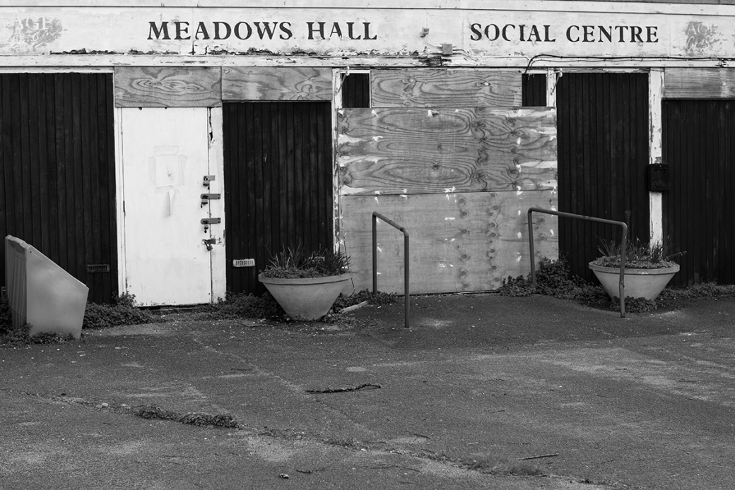
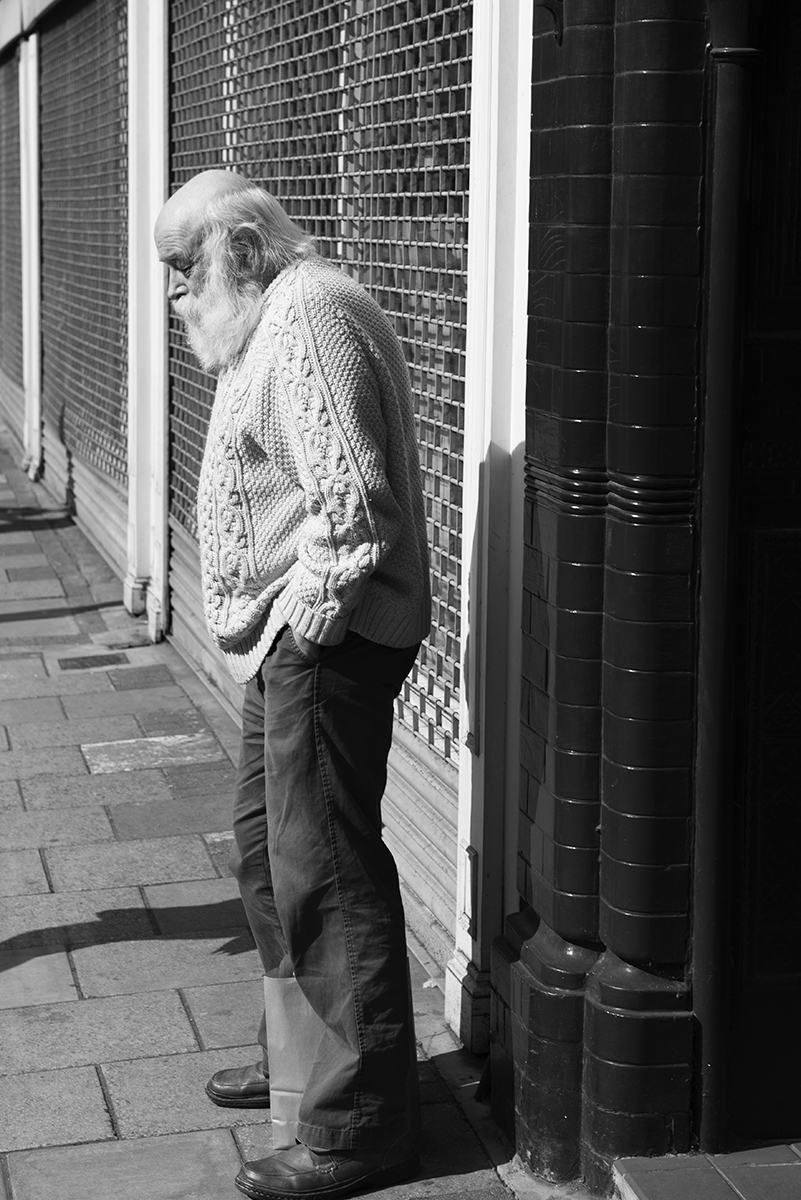
I was mindful of the advertising as well as people and places of work in the images of Evans and wanted to incorporate these into the subject of the shots I took.

Patzsch
Clean lines, form and texture were the components I was looking to incorporate into the shots around the Richmond area.
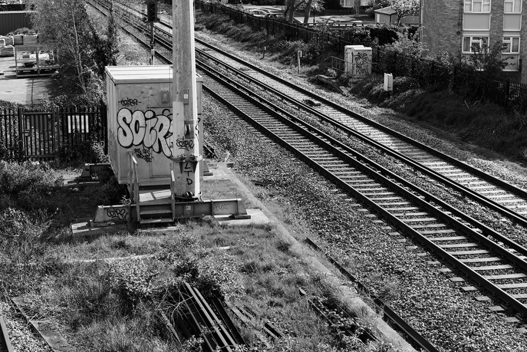

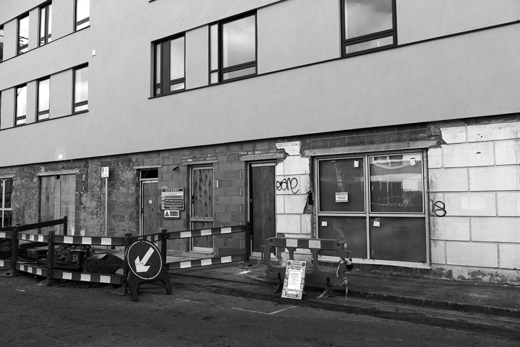
All these shots were taken using a 24 – 70mm f/2.8 lens, but had considered using a fast 50mm standard lens. I have come to appreciate the flexibility this lens can give me as well as the clarity and detail in the final result. Technically I did not feel the location shoot posed the same challenges of the studio work. There was one exception, being the building shots of the advert and flats in which there was some barrel distortion. I have not posted a few of the images from the location shoot, which were excluded from the final seven. These showed homeless people living in tents around Richmond. I didn’t feel comfortable posting these and really were a little out of keeping of the rest of the shots and the brief. Throughout his term I have had to increasingly become familiar with post production software and the final submission probably saw me employ more knowledge gained from this experience than the prior two. I remedied to some degree the distortion in two of the images in post production but also employed adjustment curves to enhance contrast across all the images in the location shoot.
Evaluations on Submissions
On the whole, I am pleased with the submissions across still life, studio and location for the term. Still life technically was very challenging, balancing a very long shutter speed to capture the laptop lighting. This was a step beyond what we had originally experienced using studio lights and adjusting those to the manual settings to expose correctly. I did feel the overall image (Information Wars) didn’t quite have enough light on the subject, despite the rest of the image being lit as it should. A greater understanding and knowledge of post production could have helped me here, but I think its going to be an area I will need to work on in the third term. The semiotic elements and interpreting the brief for the first shot did go according to plan and think I employed the facets of classical still life paintings in a modern set. The printing for the submission was in gloss, deliberately, as the light reflections would have helped the mood of the subject, matt was not really in keeping with the atmosphere of what I was looking to create. Health and safety was a concern here, given the number of power cables from not only the lights but the laptops in use. Holly is the H&S guru here, she made sure we were all very careful.
The studio submission (Apotheosis) was also a technically demanding image, with 6/7 lights in the studio involved in the group portrait. Again I think the brief was hit, taking classical portrait, in this case the last supper, but applied in a modern way. It is fair to say I have been heavily influence by LaChapelle, but was ready to acknowledge we could not incorporate the diversity of props into the set. It was a shoot I will not forget, everyone had fun and and enthusiastic to be apart of it, for which I am very thankful. Health and safety was covered carefully in the shoot, we had rearrange most of the desks to build the set. I did feel the white background could have produced a far better image, but the back was too bright in comparison to the foreground and had parts of those images clipped. The black background did expose better and across both backdrops the gels worked well for me, adding to the dominant colours of red, blue and fuchsia. I am disappointed with the final print, however, I had requested from the printers a matt finish and double the size of what we exhibited at the end of term. There was just not enough time to have it reprinted. As a follow up I think I am going to look to shoot against a white background again next term.
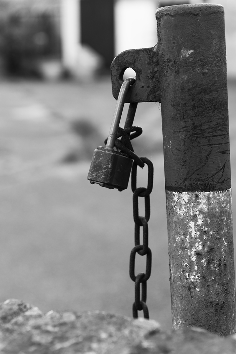
The location shoot I felt was the best of all three submissions. Last term my images didn’t say anything in the submissions, but feel the subjects in all three shoots have said more. There was a subtlety to the final images in this respect, I think if I had gone down the journalistic route of making a very topical statement, it could have missed the concepts of ‘Realism’ evident in the ‘Cruel and Tender’ exhibition. Really enjoyed post production on these images as well, turning into B&W and using adjustment curves to enhance contrast. Of the seven images, I think the padlock was the weakest and nearly left it out completely. What interested me though, was the lock was in use, but the chain was not at all, kind of ironic for the area. Patzsch covered so many diverse subjects, it also felt right to include it, even if the image itself is a little disappointing. The prints were also the better of the submissions. Adding a small white border to the gloss prints made the texture and contrast jump out.
Overall a good term, with improving choice of subjects. Post production has been a real weakness of mine and if I want to improve the final result of my work, this is the next area I need to focus on.
Criteria 1, 2, 3, 4
lovely shots. Like the light, sharpness and compositions
LikeLike
Thank you. Tried to get a sharp B&W
LikeLiked by 1 person
B&W was definitely a good choice for this set of images…it brings more depth to the images. Well done!
LikeLiked by 1 person